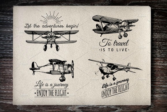
9+ Travel Poster Examples to Download
Unfortunately, this article will not be giving you travel tips on your next adventure. You can check these articles instead found on this website.
This article will be focusing on how to create a travel poster designs. Whether for a personal activity or company event, we have some examples and templates that you can download for free. We also included some simple steps in which you can use when creating a travel poster.
Elements of a Good Travel Poster
Listed below are the elements of a good travel poster. Make sure the elements are all included when you will be creating your own detailed and visually attractive travel poster.
1. Travel-related graphics and pictures: A poster is highly dependent on graphics and pictures for it to be effective. Although there are factors (elements) that need to be considered, images are the main selling point of a poster. You need to choose the ones that apply best to your poster. For example, if you are creating a boat travel poster, obviously you will be using graphics and pictures of yachts, ferries, skiffs, canoes, and not air crafts or buses.
2. Colors: Colors are as important to the graphics and pictures you will be incorporating. For your travel poster, make sure to choose vibrant and lively colors. As long as the colors compliment each other, then you can use as many colors as you want. Be careful though since there is a fine line between a beautiful design to a cluttered and messy design.
3. Typography: Typography pertains to how you will be expressing the message of your design through the text you input. Typography is not only limited to the text you write but also the font type and font size that you will be using. Depending on who will view or receive the poster, use fonts that are appropriate to the target audience.
4. Logo of the firm (or sponsors): If the travel poster is sponsored by an organization or a company, the logo of the said organization or company should be placed on the poster as well. Usually, company logos are placed on topmost corner of the travel poster. Do the same for your own poster.
12+ Travel Poster Templates and Examples
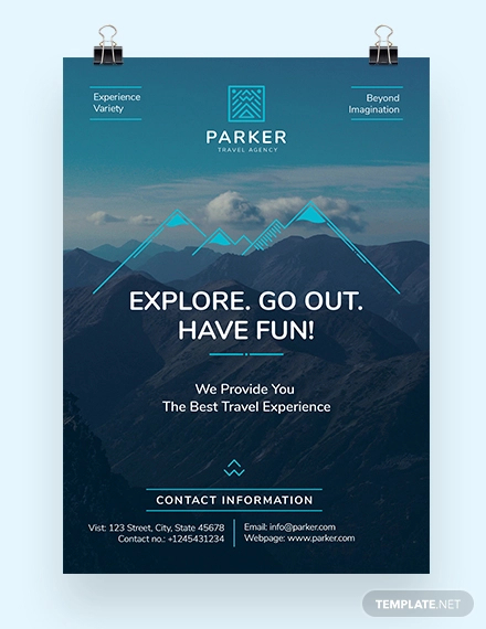
Travel Agency Poster Template
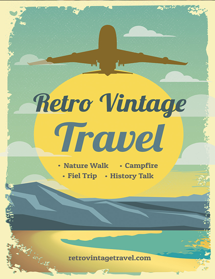
Retro Vintage Travel Poster Template
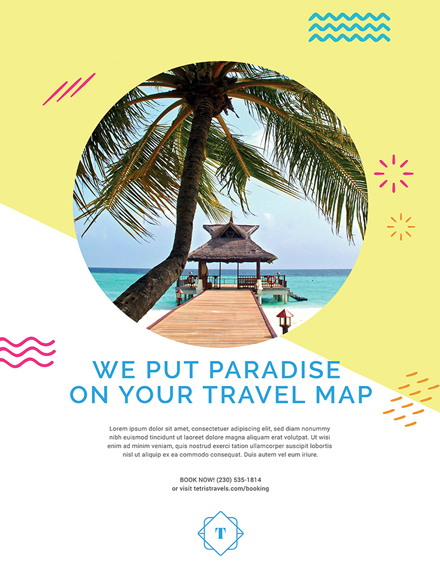
Travel Advertising Poster Sample
Brazil Travel Poster
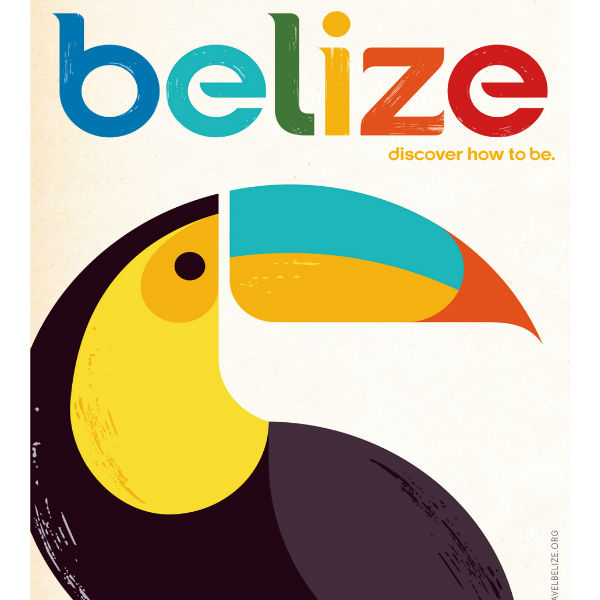
Great Britain Travel Poster

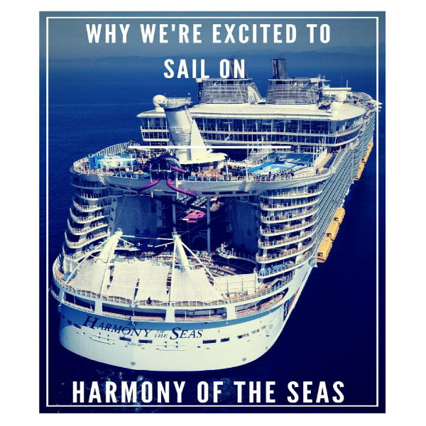
Harmony of the Seas Cruise Travel Poster
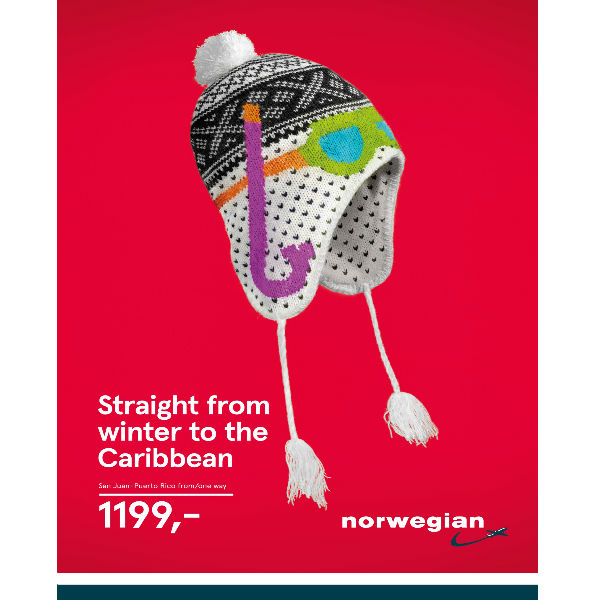
Norwegian Airlines Travel Poster
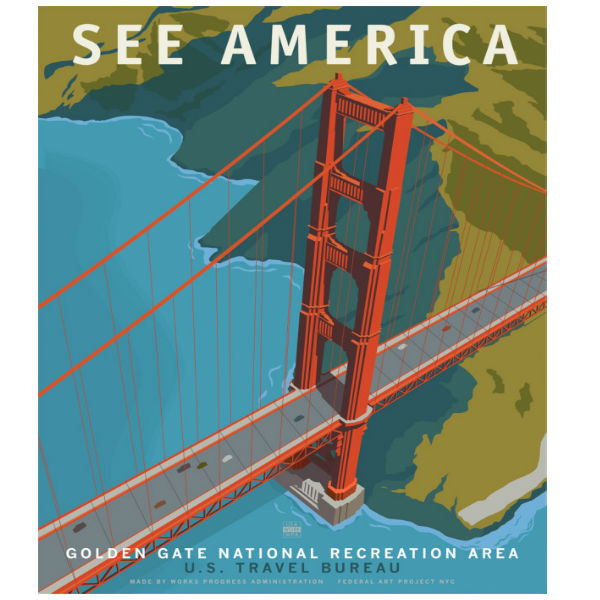
USA Travel Poster
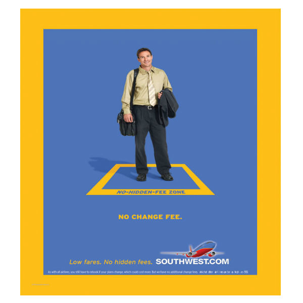
Southwest Airlines Travel Poster
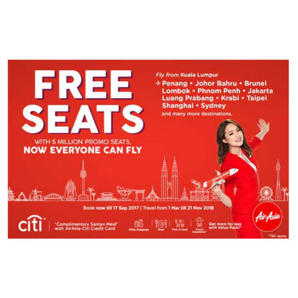
Air Asia Travel Poster
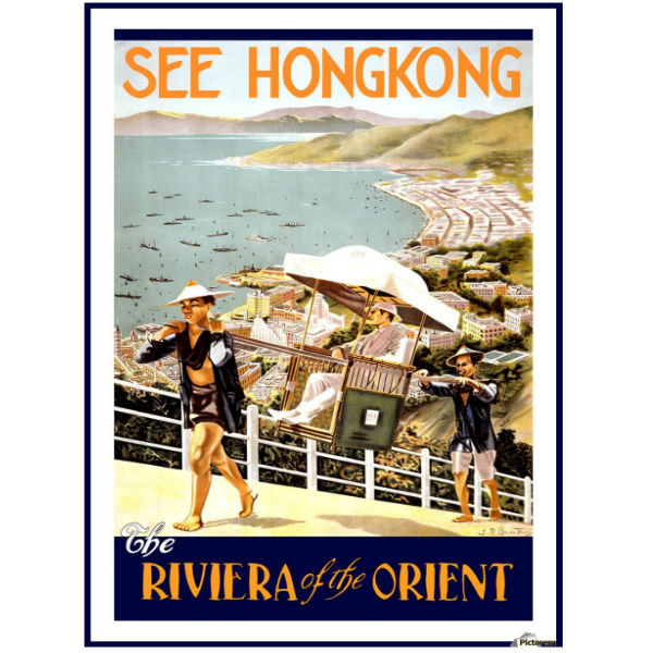
Hong Kong Travel Poster
Simple Tips for an Excellent Travel Poster Layout
Follow these simple tips when creating an excellent travel poster layout:
1. Choose a portrait page orientation: The portrait page orientation is the best layout you can apply for your travel poster. In actuality, all types of posters (and most graphic designs) use a portrait orientation. The portrait orientation utilizes a vertical or upright layout, which is best if you will be incorporating numerous text and images. Take note that you can still use the landscape orientation (horizontal or rectangular layout), but the portrait is more highly suggested.You may also see vintage posters.
2. Only use travel-related images: Since you are creating a travel poster, it is appropriate that you should only be using travel-related images or pictures. This creates a more focused and unified poster as you are using a single concept in terms of the images you are incorporating. As previously mentioned, there are hundreds of images you can use (i.e. boats, airplanes, buses, bicycles, travel bags, sun glasses, plane tickets, and passports, just to name a few).
3. Use bright colors: Traveling is fun and enjoyable, especially when spent with family and friends. This fun and enjoyable aspect should apply to the travel poster as well. One way to make your travel poster more lively is to use bright colors. Among the colors you can use are lighter or brighter versions of blue (turquoise, cyan, deep sky blue, light blue) and green (lawn green, chartreuse, green yellow, lime green, spring green), as well as orange, yellow, gold, and pink. These colors will not only brighten your travel poster but also make it more visually attractive. You may also see advertising poster examples.
When using color combinations, you can spread out the colors across the designs you will be incorporating in the travel poster. Although the images or pictures you will be using already have their own set of colors, just choose colors that complement or match the colors in the images or pictures. Try to limit your color combinations to two, three, or four to avoid clutter in the travel poster.
There is this notion if you will be simply using a minimalist color scheme, specifically a black or white combination will make any design dull and boring. It may be true in some case, but for a travel poster, you can pair up the black or white colors with other colors to make the said poster more attractive. The travel poster looks great if it uses a black and white combination as it exudes a retro or vintage feel, but mixing it with other colors is more suggested especially in this case for a travel poster.
4. Use appropriate fonts: When creating a travel poster, you should take note of the fonts that you will be using. There are specific fonts that you can use for specific events, for example professional fonts (i.e. Calibri, Arial, Cambria, Times New Roman, Didot, Garamond) for more formal events or activities. In this case, the fonts you will be using for your travel poster will depend on the formality of your event. If the event or activity is more casual, then by all means use more casual fonts. You may also see event posters.
The font styles (as well as the font sizes) will be crucial on how you create the travel poster. The font styles need to match with the designs and colors you are incorporating.
Steps to Designing a Good Travel Poster
Follow these very simple steps when designing a good travel poster:
1. Create a concept: Before you do the actual design for the travel poster, you should first create a concept on what you will be incorporating in the said poster. This includes the designs, colors, text, and images. All of these elements should come together smoothly so that the travel poster will not look clunky or disorganized. When creating a concept, you can either do it in a separate piece of paper or do the draft/concept in a graphic design software. You may also see scientific posters.
2. Purchase the poster materials (if necessary): Once you have the draft or concept in place, it’s now time to purchase the materials needed for the travel poster. You don’t really need numerous materials for creating the travel poster, as you only need special (glossy) paper for printing purposes. Pens, markers, and other types of paper are optional when you will be creating the travel poster and there is really no need to purchase these materials.
3. Utilize a graphic design software: It’s now time to create the travel poster. Take note of the tips we mentioned above so that you can create an effective as well as visually appealing travel poster. You can use various graphic design software such as Adobe Photoshop or Illustrator to create the poster. If you don’t have the graphic design skills to create the poster, you can always ask for assistance by hiring someone to do the job for you.
4. Edit or add images and colors: Once you have accomplished the final design, it’s now time to add the finishing touches to the travel poster. Edit or add images, pictures, colors, and other elements as long as they match the content you already incorporated in the poster. Make sure to always avoid unnecessary clutter so that your poster will not look disorganized, messy, or (even worse) ugly.
Travel Poster Sizes
Here are some poster sizes you can use for your travel poster:
- 11 × 17 inches (small): Also called a ledger or a tabloid, these poster sizes are also used for flyers, street lights, and bulletin boards due to their limited size.
- 18 × 24 inches (medium): This size is slightly longer and wider compared to the previous poster size. This poster size can be utilized in offices, schools, and government institutions since they are not too large which become distractions to passersby.
- 24 × 36 inches (large): This poster size is basically meant to show off and/or inform. This size is mainly used for large scale events and activities.
- Movie poster size (27 × 40 inches or 40 × 60 inches): There are two different dimensions for a movie poster: 27 × 40 inches or 40 × 60 inches. The latter is usually found in a bus stop or subway. The latter is also used for promotions in a public place or highly urbanized location.
Travel Poster FAQs
How do you create a travel poster?
Follow these easy steps when creating a travel poster: (1) create a concept, (2) purchase poster materials, (3) utilize a graphic design software, and (4) edit or add images and colors.
Why is a travel poster important?
A travel poster is important because it lets the company inform customers or potential clients of the travel events or activities which benefits them in the long run. You may also see concert posters.
What is the purpose of a travel poster?
A travel poster is created and used if a company or firm organizes or holds travel events and activities for their customers and potential clients.
We hope you found this article to be informative as well as helpful when you will be creating your own travel poster. We have provided some examples and templates that you can download for free which you can use as a reference for your travel poster. Creating a travel poster is not difficult, as long as you follow the simple steps (as well as some simple tips) we listed down, you can create the most visually appealing and detailed travel poster.


