11+ Web Banner Examples to Download
See those flashy advertisements on your screen at the moment? You’ve probably encountered them numerous times before on various websites and social networking pages. They often carry a brand message about a particular product, service, or event for site visitors to be informed. These advertising tools are known as web banners and can be easily created using professional banner templates for a polished and eye-catching design.
Ever since advertisers learned how efficient online marketing can actually be, web banners started popping out like wildfire on a variety of web pages.
Though some ads are admittedly distracting as they annoyingly fill our screens with information we could care less about, in many cases, banner ads have helped businesses boost traffic on their company websites, raise brand awareness, and increase consumer reach. But how did these web banners come to be, and how can advertisers optimize on this promotional approach? To learn more about web banners, continue reading.
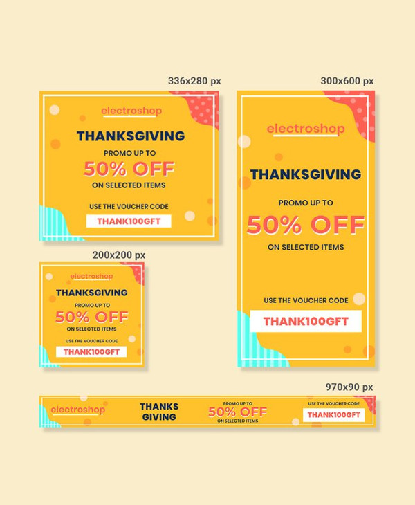
Thanksgiving Web AD Banner Template
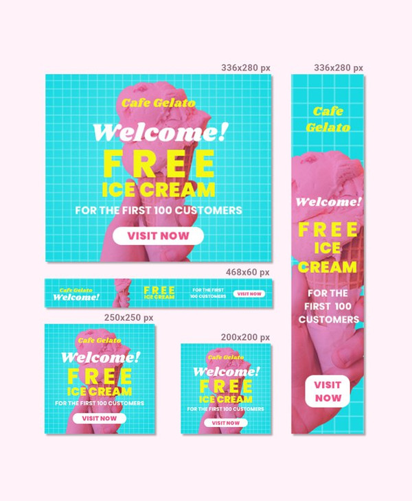
Cafe Web Banner Template
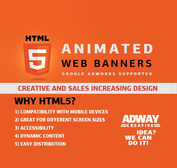
Animated Web Banner Example
What Is a Web Banner?
A web banner, otherwise known as a attractive banner ad, is a form of online advertising on the World Wide Web that is delivered with the help of a central ad server. This is done to attract traffic to a website by linking the advertiser’s website to what is being displayed so that when a visitor clicks on the ad, he or she is immediately directed to the website of the advertiser.
It’s a win-win scenario for both the host of the website and the advertiser, as the website hosting the advertisement is typically paid a particular amount for the ad to be featured on their website.
However, keep in mind that the amount paid would also depend on the size of the ad and its placement on the website.
Web banners function the same way a traditional type of advertisement is meant to function, where it’s used to notify consumers about a product or service and to present a few reasons why a person should even consider purchasing the item in question. You may also like roll-up banner designs & examples.
If you think about it, it’s almost similar to a downsized version of the billboard ads we encounter along busy highways and other public venues. But what makes a web banner more reliable is how it can monitor the impact of the ad in real-time for advertisers to analyze. It’s also a lot easier to target audiences based on their interests. You may also see business banner examples.
Unfortunately, web banners have become increasingly popular, so it’s almost impossible to visit a website without encountering at least five banner ads in a single website.
Though some ads innocently promote a certain product or service offer, there are others that contain a rather explicit content that parents may not be too keen about for their children. This has forced newer web browsers to include a software “adblocker” option to disable pop-ups or block images from selected websites for every user’s convenience. You may also check out welcome banner designs and examples.
You can even use a proxy server to avoid these banners from popping onscreen. Other extensions are also available for users to enable if they ever feel the need to block these banners as they browse through various websites. You may also see examples of banner ads.
Although there’s not much an advertiser can do to prevent people from using adblockers, they can still make the most out of the audience they’re left with by creating click-worthy advertisements that are interesting enough to keep visitors engaged. You may also see event banner examples.
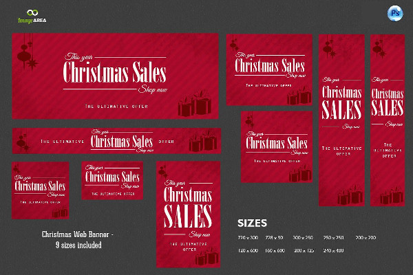
Christmas Web Banner Example
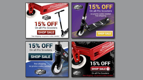
Custom Web Banner Example
Significance
If anything, banner ads have played a significant role in enabling the rapid development of paid advertising on the internet for the past decades. It’s proven to be one of the best ways for a company to generate new leads and establish their presence in the online community. You may also see roll up banner examples.
With the help of the operation (clickable link to a destination), and pricing system (impressions), banner ads have allowed websites to sell advertising in the most cost-efficient way possible.
The exposure provided by these platforms is something that other forms of media, such as newspapers and magazines, could never achieve. This unique approach to advertising is definitely an offer that’s too good to pass up! You may also like tips for designing effective banner ads.
Standard sizes
Banners designs usually come in different sizes. This would depend on the layout design of the website, and how much the advertiser is willing to spend for that particular ad space. While the Interactive Advertising Bureau (IAB) has standardized these banner ad sizes, some websites and advertising networks outside North America and Europe don’t exactly follow these standards.
Some of the most common IAB ad sizes include the following:
- Medium Rectangle
- Square Pop-Up
- Vertical Rectangle
- Large Rectangle
- Rectangle
- 3:1 Rectangle
- Pop-Under
- Leaderboard
- Vertical banner
- Micro bar
- Skyscraper
- Wide skyscraper
- Half page ad
However, it’s important to take note that the standard banner ad sizes are constantly evolving due to the alarming rate of creative fatigue and banner blindness. This is why it’s vital for banner ad designers to explore other execution methods to capture the attention of their general audience. You may also see vertical banner design.
Usage
Apart from using banner ads for online advertising, hero images are a good example of web banners being used for a non-advertising purpose.
Instead, hero images are prominently placed on a web page for aesthetic reasons. This is usually represented by massive photos, graphics, and/or videos that are situated in different sections of the website. It’s basically the first thing that a visitor sees on the website, and it often presents an overview of the site’s most popular content, such as specific site-links and relevant news links. You may also see roll-up banner designs.
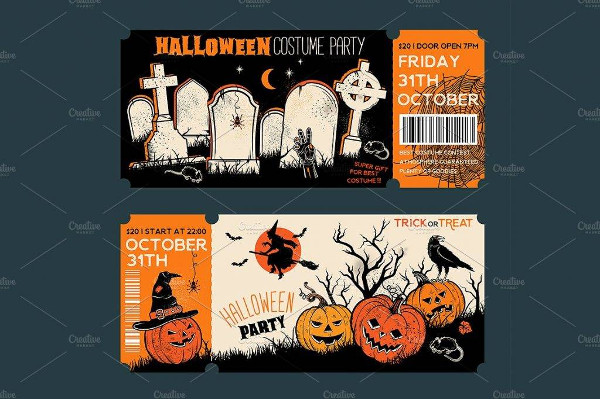
Halloween Web Banner Example
Professional Web Banner Example

Mobile App Web Banner Example

10 Web Banner Design Tips to Try
Now that we know what web banners are and how they are used in the world of online advertising, let’s discuss the basic elements of a good banner design.
When creating a web banner, there are several things that every designer needs to keep in mind. These are as follows:
1. Choose the most effective banner size.
While there can be many banner ad sizes to choose from, data gathered from Google Adsense suggest using any one of these banner sizes:
- 728×90px – Leaderboard
- 300×600px – Half Page
- 300×250px – Medium Rectangle
- 336×280px – Large Rectangle
The items listed above are known to be some of the most successful standard banner sizes to use. These sizes are a convenient option as well, mostly because they’re big enough to deliver your message, without overshadowing the rest of the page’s content. You may also see party banner designs and examples.
2. Place your ads correctly.
It’s best to purchase a space on a website where your advertisement will appear above the fold and close to the main content of the page. This makes your ad more visible for visitors to notice. These spaces are often pricier than other ad sections, but the amount of exposure it receives is definitely worth every dime. You may also see sale banner designs and examples.
Once you have identified where you plan on placing your ads, you can then determine the appropriate size to use and the right graphics to apply. If you want to highlight certain items on your ad, especially product offers, it’s best to choose a location with a bigger ad space to make your content all the more visible. You may also see company banner examples.
3. Maintain hierarchy.
Balance is crucial in design. Without it, your ad is bound to look like a cluttered mess that will leave visitors rushing to click the Close button right at the top corner of your general banner. To avoid this, you need to be mindful with your hierarchy. It should receive enough attention to increase brand awareness and drive traffic to your website.
An effective web banner generally consists of the following components:
- Logo – A company logo is incredibly important when it comes to establishing your brand identity. You want to build a sense of familiarity for customers to recognize your brand whenever they encounter it, and developing consistency is one way to do so. It has to be visually dominant to catch the eye, but not as dominant as the next two components listed.
- Value Proposition – The value proposition of your banner ad should showcase the product or service being offered, with the attention pointing toward the awesome deals or discounts that customers can avail if they act immediately. The design of your web banner is enough to capture one’s interest, but the value proposition is sure to convince them to make a purchase right then and there. You may also see congratulations banner designs and examples.
- Call to Action – Your call to action should encourage visitors to respond the way you want them to. Website CTAs usually come in the form of buttons or text links, containing the phrases “Learn more,” “Get started,” or “Watch Now.” It could be anything, as long as it sounds inviting enough for visitors to respond to. Since this is what directs people to your website or page, you should make it the focal point of the ad. You may also like vintage banner designs and examples.
4. Keep it simple.
As much as you want your banner ad to stand out, you have to remember that simplicity will always be key. It’s a good idea to keep your content and visuals as simple as possible.
Gone are the days when it was all about the flashy and colorful graphics, these days, anything that looks aesthetically pleasing is enough to grab our attention. And since viewers are likely to glance at your web banner for less than a second or so, making a banner with a message that’s easy to grasp will surely be your best weapon. You may also see party banner examples.
5. Be sure to use buttons appropriately.
Depending on the type of banner being used, buttons can greatly influence the click-through rate (CTR) of your ad. So if you do plan on using buttons, you might want to consider placing them after your copy on the lower right side of the layout. Using contrasting colors would also be necessary to make them stand out. There should be consistency throughout the set of ads as well, just so visitors would know what the ad is for and who’s behind it. You may also see birthday banners.
6. Have a defined frame.
It’s a known fact that people are easily drawn to anything that’s enclosed within a frame. This is why many web banners have a clearly defined frame surrounding its subject using graphics that extended to the edges of the box. Like if your ad is a dominant white, it’s a common practice to use a 1px gray border around the ad to not only separate it from the website’s main content but to emphasize what’s inside of it as well. You may also see valentines day banner examples
Retail Marketing Web Banner Example

Retail Sale Web Banner Example
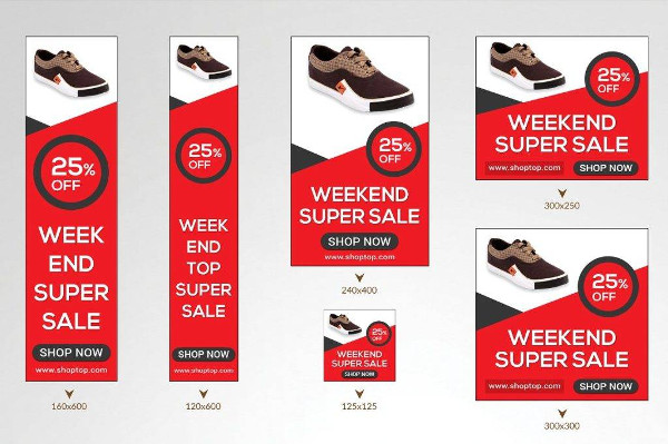
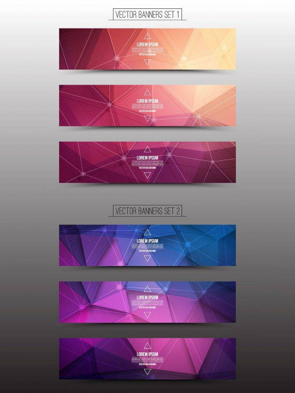
Vector Web Banner Example
7. Make it readable.
Readability should be of top priority when it comes to designing your web banner. Graphics and designs are basically useless if you can’t read the message being conveyed by the ad. This usually happens when you use cursive or script fonts that are extremely thin, as they don’t always appear as legibly as viewers would want them to. You may also see modern banners.
You’d want to use different font sizes for the headline and body copy of your text as well. Be sure to keep it short and to the point, with a maximum of four lines occupying the entire layout.
8. Explore with animation.
Web banners can be of different file types and formats, and the fact that animated banners tend to out-perform static banner ads by a mile isn’t surprising at all.
Animations, which can come in the form of a GIF or a 15-second clip, are often enticing to look at. You could stare at it for at least five minutes and never grow bored. But remember to keep it simple, as you wouldn’t want it to distract viewers from the central message of your ad. You may also check out here sale banner designs.
9. Blend properly, but stand out.
Before you start purchasing ad spaces, make sure to do your research first. You’re more likely to earn viewers if your ad complements the site where it’s featured. Though visibility is important in making your ad clickable, you need to find the right balance between standing out and blending in. You may also check out here examples of anniversary banner designs.
10. Establish brand consistency.
Lastly, never forget the importance of building consistency among every platform that represents your brand. Since your digital banner ad will link to the landing page of your website, you have to make sure that the ad matches your brand image and landing page consistently. This will assure visitors that they’ve been directed to the right page, which will then help you establish credibility for your brand.
After all, you wouldn’t want potential customers to start scrambling once they realize they’ve been directed to something that looks entirely different from what they’ve seen from the banner ad. You may also see pop-up banner designs.
There you have it! These are just some of the things that every designer should know about when creating a web banner. By learning about the basic elements of a good banner ad, along with a few design guidelines on how you can create one, you can form a truly awesome, high-performing ad in no time!


