5 Wedding Sign Examples to Download
Signs are used everywhere to give people the right direction or imply an instruction, and your wedding venue shouldn’t be an exception. As small a detail as it may seem, putting up signs on your venue ensures that everything is organized and that your goals can be realized. But aside from its primary functions, signs help tie the overall aesthetic of the wedding. Simple instructions or directions that are written in font styles that suit the theme or in beautifully handwritten calligraphy can really help in setting the mood and vibes. And given that this era revolves around technology, it makes the wedding venue picture perfect or as the people nowadays would say, Instagrammable.
Wedding Sign Templates and Examples
1. Wedding Event Sign
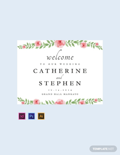
Sometimes it is better to choose the simple option, but contrary to what you may think, being simple does not necessarily equate to being bland and unattractive. Rightfully so, a simple wedding theme means that you choose to have minimal but beautiful decorations on your wedding. In addition to keeping the preparation and organization uncomplicated, it also helps you save wads of cash. In relation to this, you can always opt to choose a wedding sign that is simple but is still able to convey the message effectively. Just like this wedding event sign template, minimal flower designs and illustrations are used while emphasizing the details about the wedding. If you prefer something simple but beautiful as this sign, you can download this template for free and edit as you see fit.
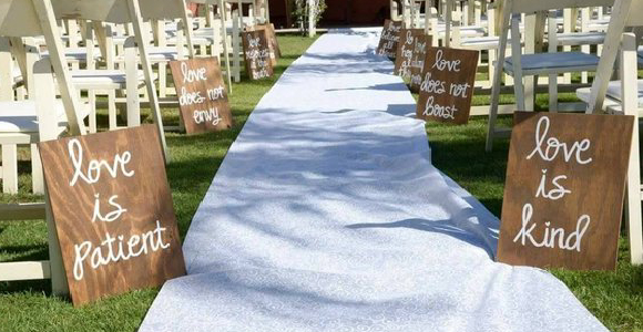
People have been drawing pictures and writing words on driveways with chalk for a long time now. And the simplicity of the act has turned into an overall beautiful aesthetic. Nowadays, it is common to see signs that use the basic color of a chalkboard and a font style that resembles the font when writing with real chalk. With that said, using that style and overall aesthetic with your wedding sign will surely impress your guests. A chalkboard sign with a gorgeous cursive font that presents information about the wedding or you and your partner’s favorite quote, etc. will surely tie the knot with your overall theme. This wedding sign is the perfect example of how a simple art style can make your wedding more picture perfect.
2. Bee Crest Wedding Sign
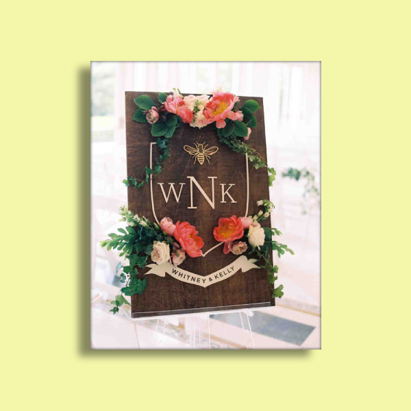
If you want to go over the top, then, why not? If that is how you want your wedding to be like so, you have all the right to do as you please. With that, you should always choose a wedding sign that bests represent you and your partner’s style and aesthetic. If both of you prefer to have glamorous and extravagant designs and decorations for your wedding, it is best to still choose what fits the overall theme. As you can see in this wedding sign example, it has the layout of a simple crest. The emphasized texts are the initials of the couple along with their spelled-out name on the band found at the bottom. It is also adorned with beautiful and colorful flowers that makes the sign more attractive and pop out for the crowd to see—a truly eye-catching sign worthy of attention. This exudes elegance and royalty perfect for the over-the-top couple.
3. Casual Greeting Wedding Sign
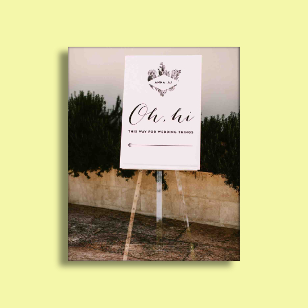
If you and your partner are the laid back and casual type of people, this sign is perfect for you. You can greet your guests with the casual hello and still make it aesthetically pleasing. As you can see in this sign example, the main designs elements are only the flower-adorned border that emphasizes the name of the couple on top and the minimalist arrow that directs the guests where the venue of the ceremony or reception is. The texts used are the casual greeting “Oh, hi” along with the casual phrase that directs the guests to the venue sends chill vibes to the guests. Overall, this example is a perfect inspiration if you want a simple, laid back, fun but still welcoming and effective sign for your wedding.
4. A-Frame Wedding Sign
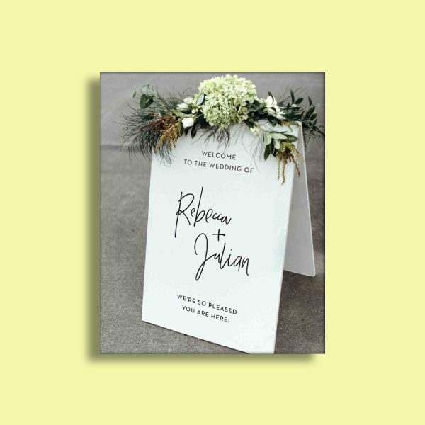
The font style that you use for your wedding sign will make all the difference in the world. It can totally convey the vibes that you want your guests to feel as they enter your venue. Sending simple and sweet feels to your guests can be easily achieved through your wedding sign. Take this A-frame wedding sign, for example, the frame is topped with a spray of hydrangea and greens that make the overall white A-frame more attractive. Not to mention, the perfect font style that was used to send welcoming words along with the couple’s names, it makes the sign more attractive and chic.
5. Neon Lights Wedding Sign
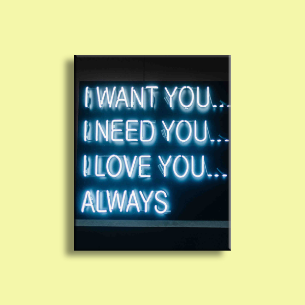
If you want practicality, why not invest in a custom-made sign that can be used during the wedding and can also be used as a keepsake? This freestanding neon sign example features the words the couple has always signed their notes with. Just like a digital sign, this sign will surely shine brightly in any low-lighted venue that will surely captivate your guests. You can totally do this for your wedding too, just make sure to choose the right vendor that will achieve your vision at a reasonable price.
Wedding signs will surely make the feels and vibes of your wedding be what you want it to be. You can put up as many as you’d like and can either be instructional or inspirational, it is totally up to you. We hope we have inspired you with the various wedding sign templates and examples we have featured in this article. Both templates and examples are free for download from this article.


