10+ Workshop Brochure Examples to Download
Workshops have become a popular means of learning for individuals that seek to enhance their skills beyond what the academe can offer. This kind of engagement has gained widespread interest among people of different fields. But promoting these types of events can be quite difficult, especially when budgeting becomes an issue.
Fortunately, brochures, being one of the most popular promotional mediums there is, serve as the perfect option for advertisers looking to market their services using a cost-effective tool. However, there are a few factors that one must consider before employing a brochure campaign. You may also see advertising brochure examples.
School Program Workshop Brochure Example

Professional Workshop Brochure Example
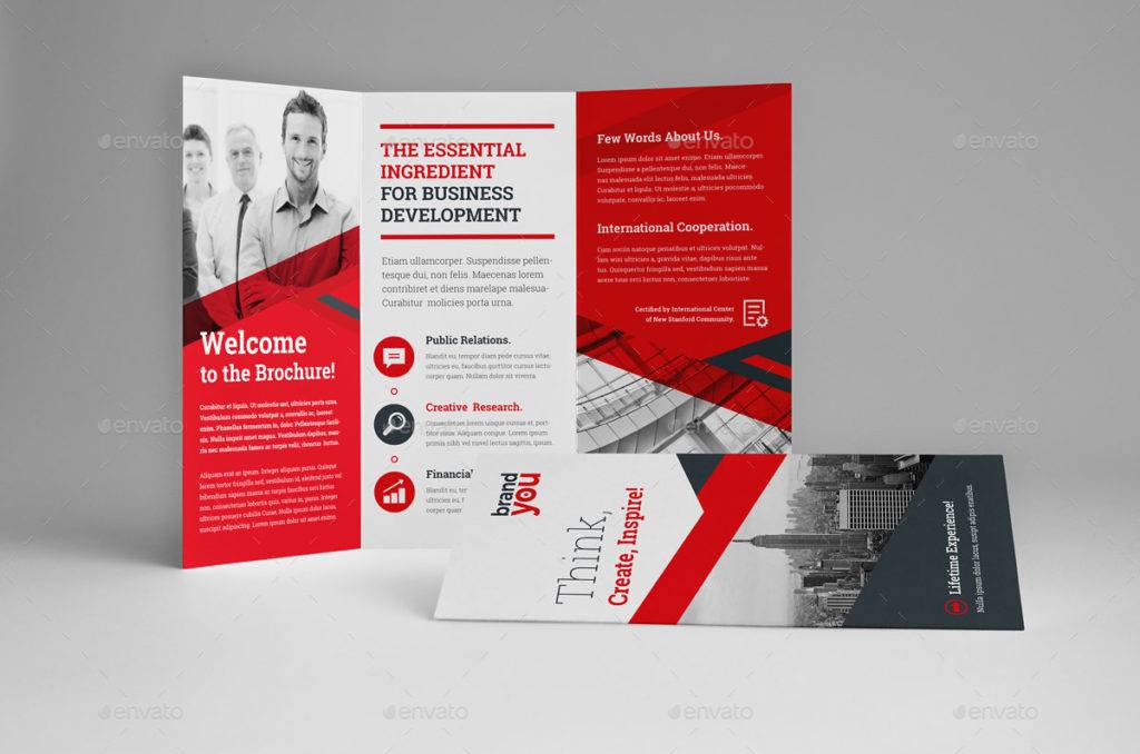
Trifold Square Workshop Brochure Example
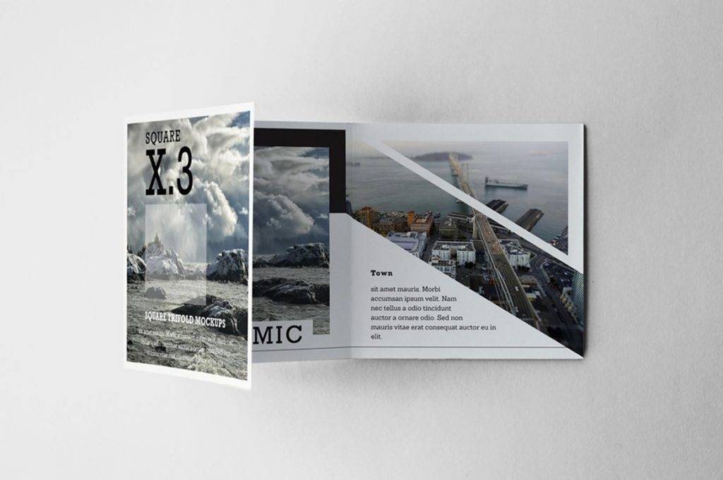
What is a Workshop?
A workshop is generally defined as a meeting between a group of individuals who engage in a discussion or an activity based on a given subject matter. Here, the instructor leads the discussion, conducts activities, and evaluates the work of students. The student may also receive critiques from fellow students. For this reason, workshops can often be a pretty intense process, where students may garner a lot of detailed feedback from their instructor. The number of participants could range from a dozen to a hundred attendees, depending on the venue’s capacity or the type of workshop being conducted. You may also see tri-fold brochure designs & examples.
Workshops are often tailored according to their intended purpose. In the field of business, these training sessions are usually more formal and systematic in nature, where the primary aim of the workshop focuses on the personal development of its participants. Many companies administer these workshops as a form of team building activity for their employees. As for talent workshops and the like, these are managed as a means of learning to develop an individual’s skills in a specific craft. You may also like brochure examples in psd.
The Difference Between Workshops and Seminars
Workshops and seminars are similar in certain aspects, yet they do possess distinctive qualities that set them apart. For instance, the audience size of a seminar is usually much larger than that of a workshop. Because a seminar simply involves relaying information, a limited seating capacity is required to accommodate attendees. Workshops, on the other hand, require direct interaction between the instructor and the participants present in the region, therefore a maximum capacity of 100 (or possibly more) must be observed. You may also see examples of company brochure.
When it comes to the structure and timing of workshops and seminars, a seminar is commonly a one-day event that lasts anywhere from one to eight hours, where one or more speakers who possess first-hand insights on the topic will share what they know with the group. As for a workshop, it could last for about thirty minutes to a few hours. This usually takes place in conference rooms, labs, classrooms, or studio-sized areas. You may also like real estate brochure designs & examples.
Purple Trifold Workshop Brochure Example
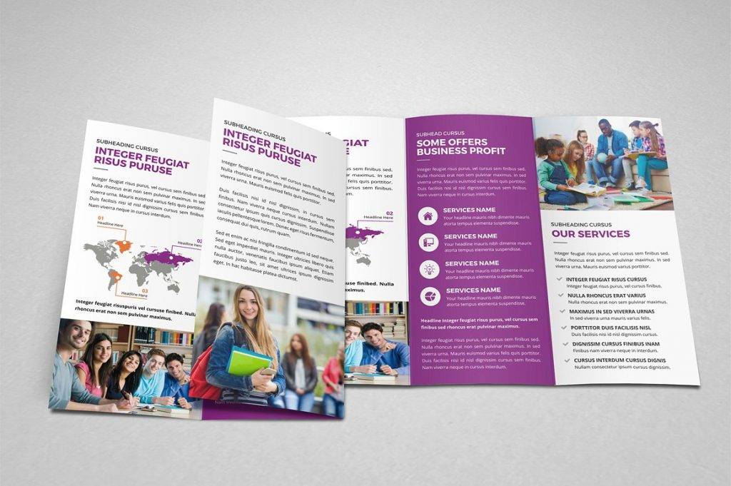
Yellow Workshop Brochure Example
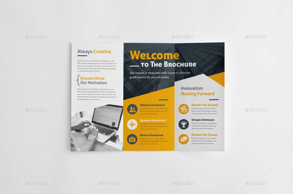
London Workshop Brochure Example
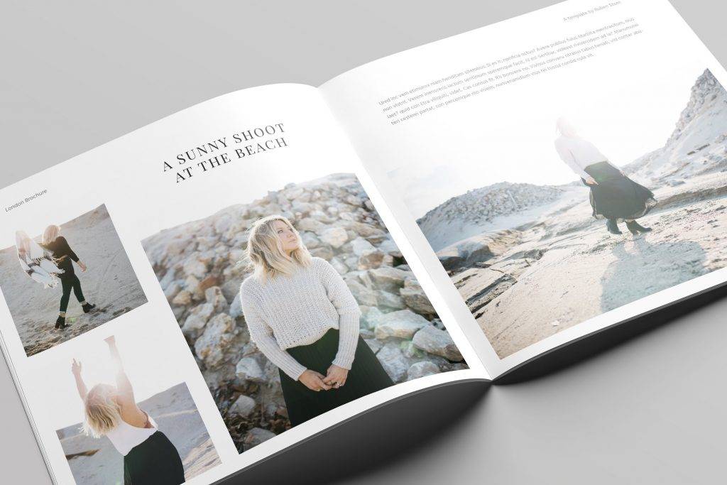
Bifold Workshop Brochure Example
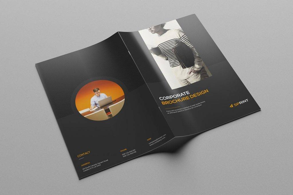
What You Need to Know about Brochure Marketing
A brochure plays a vital role in marketing, as it helps a business communicate effectively with its audience. But brochure marketing can also be a daunting process for many marketers and industry entrepreneurs, considering the amount of effort that needs to be applied when producing one. You may also see medical brochure examples.
However, brochures can be beneficial to a business in a number of ways. When used employed properly, the business can easily lure in prospects, get their message across, and foster sales and revenue.
1. Business Cards VS. Brochures
Have you ever received a business card from a salesperson, but wished you could’ve gotten more information about what they do and how they could be of service to you instead?
While business cards enable marketers to open conversations, or even keep it going, with potential clients or customers, most people would rather have something on hand to look at, store, and refer back to whenever the circumstance calls for it. And even with the easy access of the internet for delivering information to users, most people expect ‘real’ companies to at least have good quality printed product and sales materials in store. Keep in mind that a business card may only possess personal or business information, such as one’s address and contact details, while a brochure provides consumers with detailed information about a brand and its offers.
2. From the Customer’s Point of View
When creating any form of marketing material, it’s always advisable to keep your audience in mind. Visual graphics may prompt an individual to pick up the brochure, but it’s what’s inside that can keep them engaged. The content of the brochure must contain useful information about the company, product and service offers, as well as other details that support its purpose. Conducting various crowd sourcing or surveying programs to acquire data regarding the wants and needs of target consumers will help you create a road map for your brochure. You can answer these inquiries and tailor your brochure according to the suggestions given by the proponents of the said survey. You may also like examples of business brochure design.
Remember, you need to view your simple brochure from a customer’s perspective. This way, you may easily identify what it lacks, what must be improved, and what can be considered as relevant and practical.
3. Judging by its Cover
Though the real world tells us never to judge something by its cover, it’s hard not to analyze something and draw conclusions from it based on what we see.
Truth is, what we see can sometimes reflect what’s inside of it. Since most advertising mediums rely on visuals to attract an audience, it’s important to create a brochure cover that speaks loudly and proudly of what it represents. Using a catchy company tagline, compelling headlines, and eye-catching images can greatly influence one’s perception. Don’t assume that everyone would enjoy a mysterious cover that says very little about the brochure and its content, as not everyone would take the time to look past its cover. The cover should be able to pique a person’s curiosity and encourage further reading, without giving out too much details. You may also check out examples of bi-fold brochure design.
4. The Message
The most significant element of a modern brochure is the message it conveys. A brochure that can pull in a reader through its visual design, yet fails to communicate its brand message, is as good as nothing. To ensure that readers are able to grasp every word being stated, you need to set a tone. It must be direct, personal, and targeted towards the reader. Building a tone that speaks to every one of your readers will help increase the brochure’s response rate and build a level of interest among audience members.
5. Call to Action
What’s the point of creating a brochure, or any marketing medium in general, without having a call to action? You need to give people an idea of what their next move should be. This will motivate them to respond the way you want them to generate better results. Whether persuading people to buy a product, directing them to your website, or driving them to your store, your call to action must be spelled out clearly for readers to catch on. You might be interested in event brochure designs & examples.
Square Portfolio Workshop Brochure Example
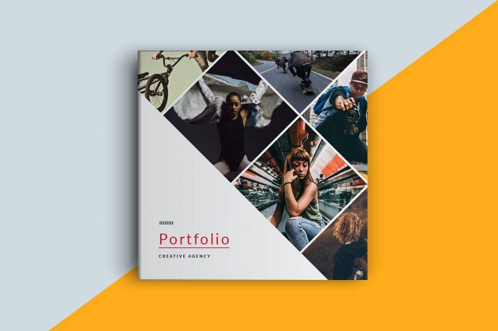
Mini Workshop Brochure Example
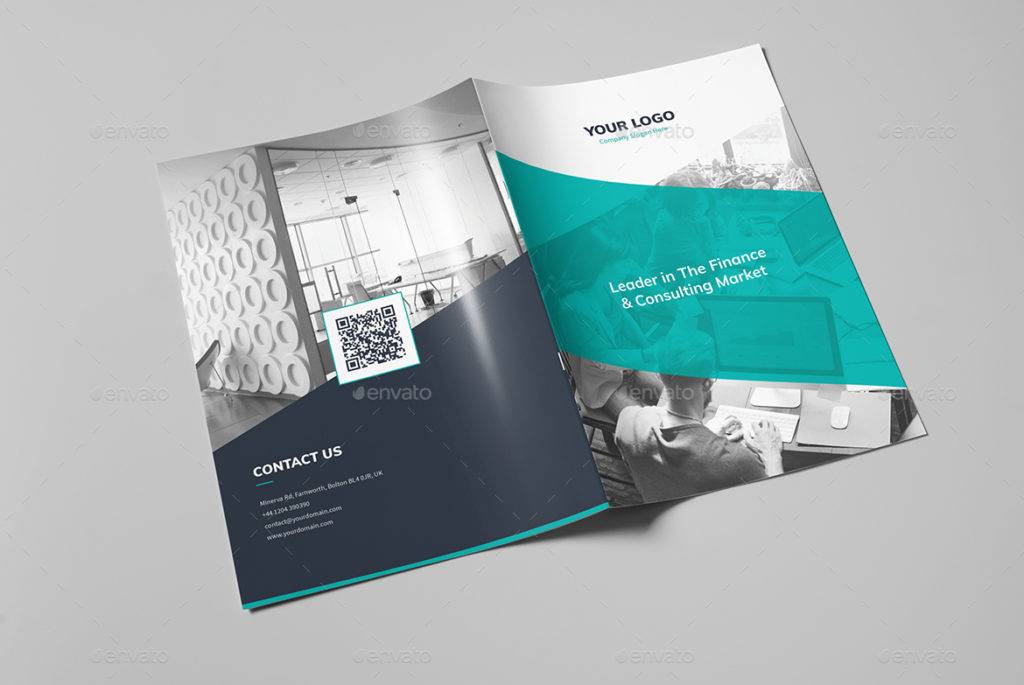
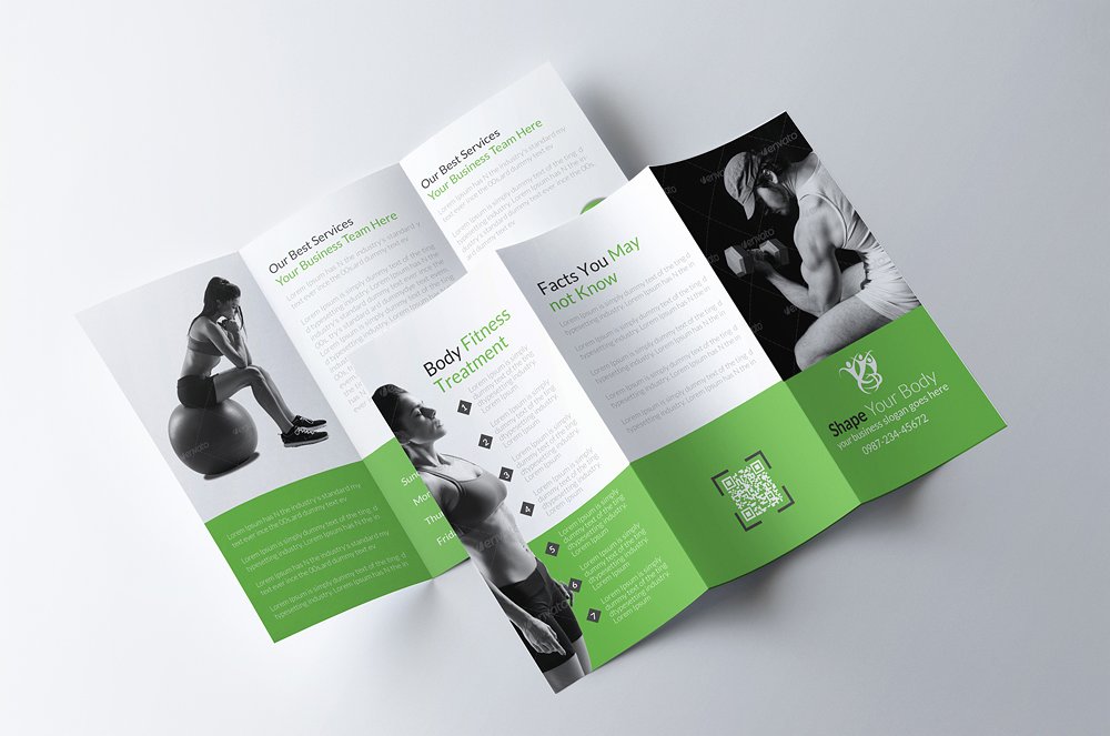
Green Fitness Workshop Brochure Example
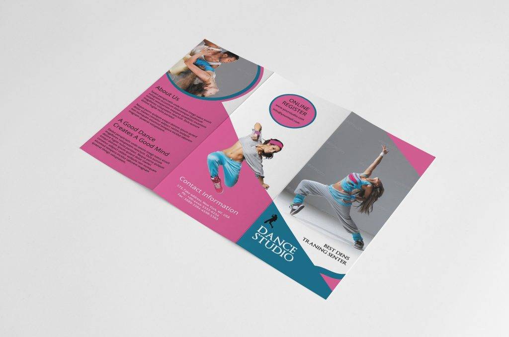
Dance Studio Workshop Brochure Example
Design Tips for Effective Brochure Marketing
To design the prefect brochure, there are a few factors that must be taken into consideration first. After all, it’s not just about making something look attractive, but it’s all about creating something that may impact the look and feel of the medium for it to communicate a message properly. So to guide you through this process, here are a few design tips for you to apply:
1. Know your audience.
It’s always important to know what your customers look for in a brochure. This could be a brief background about what your business is about, as well as a short description of your products and services. You must also consider how the brochure will be distributed to the masses. Brochures that are handed out to passersby need to be of a compact size to make it easy to carry around. Other business brochures that target stakeholders and executives are usually thicker and more detailed than most.
2. Use high-quality materials.
High-quality and high-resolution resources are a must in advertising. This includes images, logos, illustrations, icons, typefaces, and color palettes. Keep in mind that anything of poor quality would be completely evident to the naked eye, and given how people can be very meticulous, the medium is bound to face various criticisms. In no way is this acceptable for a business to have, as it often reflects the image of a given company. You may also see sales promotion brochures.
3. Follow a visual theme.
Finding a good theme and sticking to it is a clever approach for a brochure design. This will help develop consistency to keep readers engrossed. If you’re having trouble choosing the final output, try creating multiple samples of the brochure to assess which design works best.
4. Proofread.
Not only is a flawed brochure an embarrassment to a company, but it’s also a costly investment that many businesses can afford. For this reason alone, you must proofread the design before having it printed. Check for any typos or mistakes that may have been overlooked. You can also have someone else review it for further assurance. You may also like travel brochure designs & examples.
5. Pay attention to print specification.
Creating a print bleed is an important step in the design process. This will prevent necessary details from being cut out of the find product. When using illustrations and graphics, always remember to use vector designs to prevent low-quality outputs. Additionally, CMYK colors must also be a priority. You may also check out best brochure examples.
Designing a brochure can be a lot of fun, but there are many things to consider before you embark in such a huge task. A strong brochure design that is printed professionally and actively marketed serves as a potent promotional tool for any business type. So for your next workshop program, remember to keep these brochure marketing tactics in mind!


