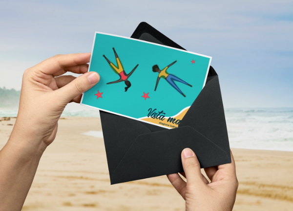
Postcard
Away from home, especially during a vacation, you want the time to relax, abstain from electronic devices, avoid the busy streets, and taking much of your time breathing fresh air, away from the city, away from the crowd. You may want to disengage from social media, but that does not mean that there is no way to keep in touch with your loved ones. Through postcards, you can let them know that you are thinking of them, you can inform them what you are currently doing, and any updates of your life, without the need to check your emails and social media messages. Postcards communicate your message without the need of a smart phone and internet access. This will take you back to traditional snail mail, when communication is still in the form of physically writing your message on a paper to be sent via post office, which is already rare nowadays and which can excite you whenever you received one because of its rarity.
View more postcard templates and example at Templates.net.
Elements of a Well-Designed Postcard
Here are the important elements that must be present in a postcard:
Logo: The recipient must know where the postcard came from; hence, placing a logo can help you not only introduce yourself but also establish branding. Note that although you need to include your logo in the postcard, it must not overshadow the other elements of your postcard.
Headline: Your headline must present the main idea of the whole content of your postcard. Your headline must be clear and concise. It must be something that can catch the interest of the reader, and it must have a font size bigger from the rest of the text.
Photos and Graphics: Your photos, graphics, and illustrations must be relevant to your overall concept or design. Aside from that, it must be high quality and not pixelated.
Typography: Typography means arranging the text and space within a given area. It also encompass the typeface as well as the color. It is also concerned with the spacing between the characters and the spacing between two lines of text. You have to know the importance of choosing the correct typeface as it can clearly affect the overall presentation of our postcard. More often, designers would prefer simple and serif fonts for serious and professional information.
White Space: White space is important in every design. It refers to the negative space in between the elements of your design. For example, it may refer to the space between the graphics, the headline, and the text. It pertains to the breathing room of the elements of your postcard. This would also help your postcard to look arranged and not cluttered, improving legibility and drawing the attention of the audience to your design.
Colors: Colors are also extremely important in your design as they can capture the viewers’ interest. In choosing the appropriate colors, you may work on at least two colors and use their hues and tints. This will make your design look more elegant and stunning. It does not always mean that bright and bold colors can help make your design pop; if you only know how to properly choose colors that are appropriate and relevant for your whole message, then two colors would do in making your design more interesting for the audience.
Offer: In postcards that are primarily used in marketing, you can include offers, evoking the readers to make an immediate response and giving them a compelling reason to accept your offer. They must feel the necessity to take an action before it is too late. It is recommended to include great discounts and most especially limited-time offers.
Call-to-Action: Last but not the least, a call-to-action must be present in your design. This will encourage the readers to do the next step upon reading your offer. Your call-to-action must specify the necessary step that the reader must do in order to accept the offer.
10 Postcard Templates
Business Moving Postcard

Business Thank You Postcard

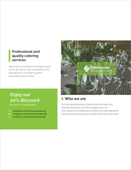
Catering Business Postcard
Cleaning Postcard Design

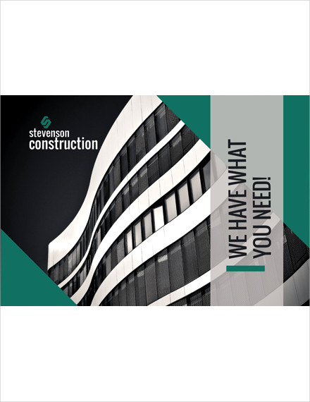
Construction Business Postcard
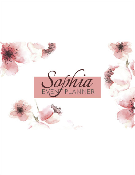
Event Planner Postcard
Multipurpose Business Postcard

Blank Postcard Example
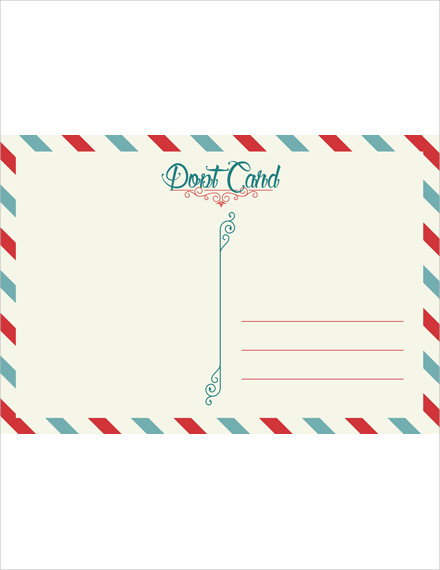
Blank Vintage Postcard
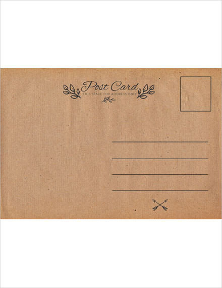
Plain Postcard Design
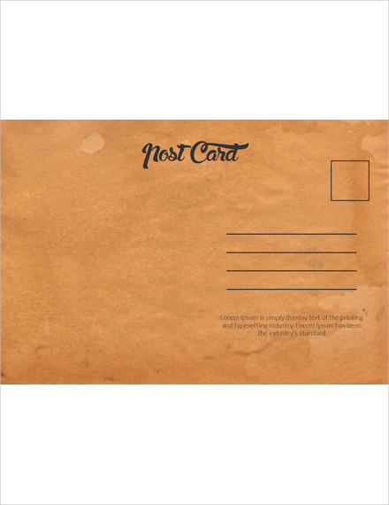
African postcard Example
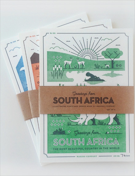
City Postcards
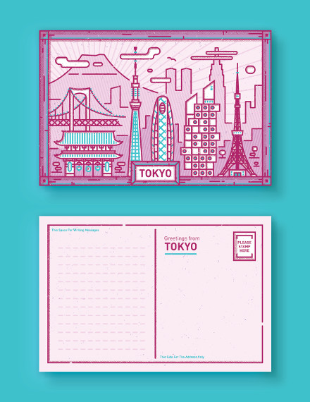
Simple Postcard Design
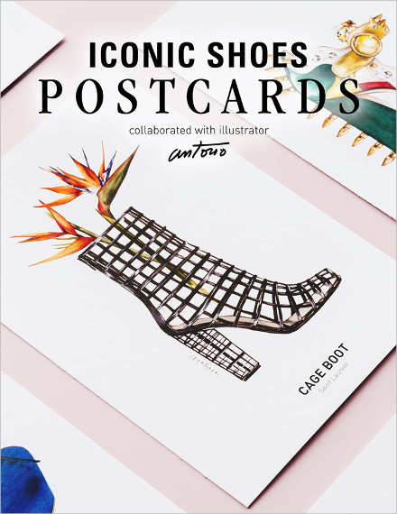
Steps and Tips in Designing a Postcard
Creating a postcard can be fun and challenging. Following these simple steps along with the useful tips, you can surely create a postcard according to your own preference.
Display Your Logo Prominently
As stated above, your logo is an important element that must be placed accordingly in your postcard as this will enhance your branding. Your logo must be displayed prominently on the face of your postcard, letting the reader be informed of who you are through your logo.
Include Relevant and High-Quality Photos
Then, add photos and graphics that are relevant to your postcards. Usually, postcards are highly visual, and people can be more focused on the graphics than the text itself.
Incorporate Appropriate Colors
After, choose appropriate colors for your layout and text. If possible, use colors that are according to the overall theme of your design, and never use too many colors. As stated in the previous section, keeping your colors to a minimum would help enhance the visual presentation of your design.
Keep It Simple
Keeping your postcard simple can make it more attractive rather than incorporating too many elements or graphics that are irrelevant.
Avoid Visual Clutter
This can be achieved by providing enough white space for your design. A white space is something that would give your elements a room to breathe. This would also help the viewers to focus on certain elements in your design.
Add Special Finishes
Finishes can also be great when you want to achieve something that is unique and presentable. Die-cut designs, round corner, and other special finishes would enhance the overall design of your postcard.
Choose a High-Quality Paper Stock
In choosing for a paper stock, thicker papers are usually preferred since they are durable and cannot be easily torn. However, there are also some papers that are not really thick but can still provide high quality for your postcard.
Proofread
Lastly, before sending your designs for print, make sure that you carefully check and proofread your work for errors to avoid reprinting. Check if there are any spelling and grammatical errors and if there are misplaced photos in your postcard.
How to Create a Postcard in Word
Creating a postcard in MS Word is possible although many designers would suggest using other professional software and applications. But, for simplicity, you can utilize MS Word in creating a postcard following these simple steps.
- Open a New Document and choose in the Templates a blank postcard template.
- Enter specific information that you want to appear in your postcard.
- Add images and adjust them according to your preferences.
- Add your logo. As has been stated, logo is important in order for you to expose your branding.
- Customize other areas. You might also need to do some edits and changes on the other areas of your canvas.
- Work on the back portion. After you have finished working at the front, also design the back portion of your postcard.
- Check and recheck. Before printing them, check and recheck for any materials errors.
- Lastly, save your document.
Types of Postcards
There are several types of postcards that you must know, and these are as follows:
View Cards
These are postcards that people have long collected as they mostly feature their hometowns or places they have visited. Moreover, view cards also feature buildings, streets, and towns that may no longer exist or those that have changed drastically.
Greeting Cards
Postcards can also be used as a greeting card even from the early times. It can be sent for birthdays, Christmas, Easter, New Year, and any other holidays and special occasions. They are usually designed using intricate embossing techniques, high-caliber art work, superior inks, and finishes are typically added such as glitters, ribbons, and feathers.
Historical Cards
These postcards are used to commemorate important historical events such as war, social problems, parades, coronations, politics, disaster such as floods, fires, earthquakes, typhoons, and wrecks, and may other relevant events in the history that impact people’s lives.
Art Cards
These cards are particularly collected mostly by art collectors since they feature high-quality arts and they are very rare nowadays. They are created by skilled artists who use postcards as their canvas to showcase their artworks. Hence, they are sold for a much higher price and they are being sought after by many postcard collectors as well as art collectors.
Photographic Cards
Photographic cards usually feature real photo art studies of nature, animals, beautiful women, children, lovers, among others and are often hand tinted in great detail and in colors which almost defy description. Photomontage techniques are becoming more popular nowadays allowing photos to be altered into original art creations.
Standard Sizes of Postcards
Postcards come in a variety of sizes, and these are as follows:
Regular Size
This size of postcard is often used in many of the older cards. The specific dimensions for regular size postcards are 3.5 × 5.5 inches or 9 × 14 cm.
Continental Size
Postcards with continental size are mostly published after the 1940s, and you can find a lot of this size of cards at the stores today. The specific dimensions for regular size postcards are 4 × 6 inches or 10.5 × 15 cm.
Oversized
The usual size for oversized cards are 5 × 7 inches. However, there are some varieties that are in larger sizes. These cards are popular with postcard companies and tourists and many postcard collectors do not usually choose them as they are more expensive than the other sizes of postcards, cost more to mail, and hard to trade with others. However, others would invest in this card because of the detailed view of the scenes featured on the cards.
Modern Size
Often classified as a smaller type of oversized cards, these cards can be found in most stores nowadays and many people prefer them as they are usually of high-quality graphics and excellent choice of photos. The size of modern size postcards are about 6.5 × 4.75 inches.
You can find more interesting postcards on Templates.net.


