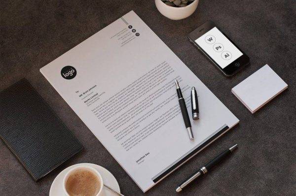
15+ Formal Letterhead Examples to Download
Branding. This one word encompasses a very broad topic with regard to a business entity. It does not simply mean your brand or your company name, but it goes even up to your marketing strategies, promotional materials, and a lot more. Branding is severely important for companies because this will establish their personality and for people to know and acknowledge them. Naturally, people would usually prefer those with brands over those that are brandless as a brand would signify authenticity. One effective way to maintain consistent branding is by using professional letterheads in all official communications, which can be easily created with customizable letterhead templates.
Blue Letterhead Template
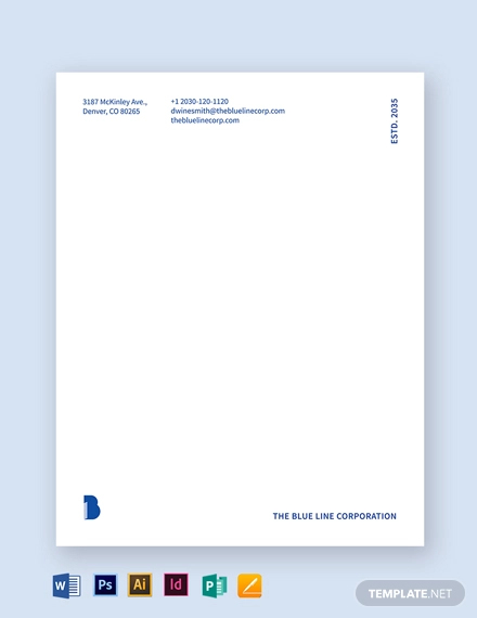
Narrowing it down, we will discuss about letterheads, a form of branding and establishing the personality of a company. Your business letters must have a letterhead so it will be identified and associated with your company. It is like you are proudly waving your attractive banner, telling the people about your company. Letterheads would also make your papers more proper and formal. Hence, in this article, we are providing you formal letterhead examples. Check them out in the next section.
Formal Letterhead Template for Word Example
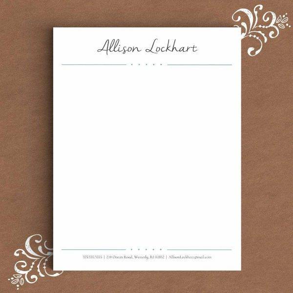
Simple and Formal Letterhead
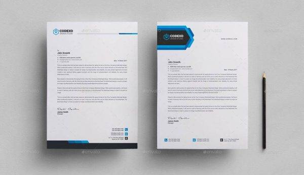
Downloadable Formal Letterhead
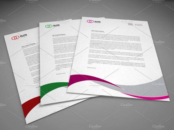
Killer Tips for Letterhead Design
In designing your letterhead, you must design it in a way that it expresses the personality of the your company. Not all company letterheads require to be formal. There are those that are bubbly, cheerful, playful, and artistic. However, you must know the limit and establish a fine line between being formal and being playful and artistic. To start, you must first know your business or classify the industry that you are in. In this way, you will have a general perspective on what you are going to achieve in the appearance of your letterhead. You may also see professional letterhead designs.
To start, here are few killer tips for letterhead designs to guide you in making your own company letterhead.
1. Start Simple
At first, you might find yourself staring at the blank piece of paper or the monitor ready to transform it into a perfect letterhead that you imagine, but you do not know exactly how to start and whether it fits your company or not.
Although letterheads must have a wow factor to create a lasting impression to the readers, they are not really intended to be showy. Instead, the main focus is the content of your business letter. Your letterhead serves as a frame for the text in a professional way, without distracting the vision of the reader.
In your first designs, do not bombard your letterheads with heavy or complicated designs, and try to aim for a minimalist and formal letterhead that has a subtle style. Geometric shapes like triangles or diamonds with varying sizes and colors can already add a splash to your design.
2. No-Color Printing
Although we are already living in a modern society, there are still offices that use printers for black and white and without colors.
For small businesses, buying a colored printer is not practical especially when no paperwork are needed to be printed. Hence, if you cannot print with full colors, you can still utilize and maximize the potential of black-and-white printing. You can use monochrome designs that will still appear strong and presentable when printed in black and white. You may even incorporate art deco styles that uses lines repetitively to form patterns and styles. It may be simple, but it really works well with businesses like hotel and retail businesses. You may also see appointment letters.
Formal Owl Letterhead Example
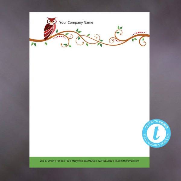
Ready to Print Letterhead Design

Clean and Formal Letterhead Example
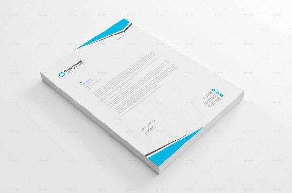
Bohemian Formal Letterhead Example
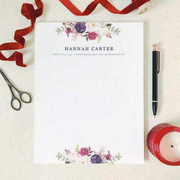
Editable Formal Letterhead Example
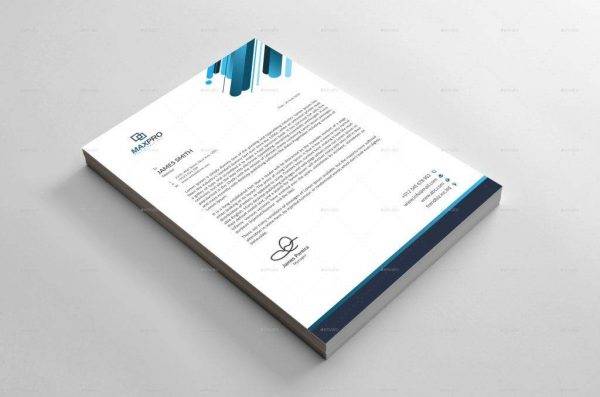
3. Start-Up Designs
Many companies dealing with technology and other creative agencies utilize colorful designs with 3D style, highlights, shadows, and gradients. You can even incorporate curvy shapes with a color scheme of rainbow but not using too many colors.
Ensure that you blend some colors for it to appear soft and smooth. These will help the appearance of the letterhead to be more optimistic and customer-friendly. However, this design may not be appropriate if you are using it for formal companies and firms such as in letterheads for legal firms and accounting services. You may also see verification letters.
4. Strong Brand Design
Take note that you must incorporate your branding in your letterhead, so make sure that you already have a strong brand design. You need to have some basic but essential elements to be included in your branding.
To choose the color scheme, you can start working with the color you have in your attractive logo. This will greatly help people to immediately recognize you and remember your company as well as your products and services. However, if you have not yet created a logo, start creating one by choosing a great color combination—colors that would complement with each other. Black and yellow are a great example that provides a striking appearance. Another is blue and white.
5. Go Retro
You may also play up the retro or vintage theme by using typefaces, layout styles, and colors that are used in the past years, maybe a subtle reference to the style from the 1950s to 1960s. Examples of font types that would achieve this look are the Manson and Source Code Pro. Always remember that typography is the key to achieve the overall design. And don’t forget to keep your letterhead design minimal, providing enough white spaces and utilizing only one to two colors. White space or the negative space refers to the area in the sheet that is left unmarked or without a print.
6. Use a Watermark
You may already have a border or corner designs in your page but it seems that there is not enough room for your text. Your content may appear crowded and jammed. As a solution, you can add a watermark to the page. It would extend the amount of space available on the page, and you are adding color and graphics without sacrificing space.
Just make sure that the design for your watermark complements well with the other colors in the page. Better if you use colors with hues related to the color of your best logo to be consistent with your colors. Note that it must neither be too dark for it might obscure text, nor too pale or light that they may lack impact to the viewer.
Fully Editable Formal Letterhead
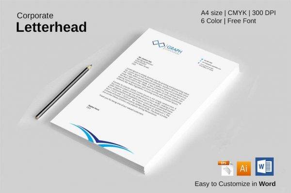
Fancy Monogram Formal Letterhead Design
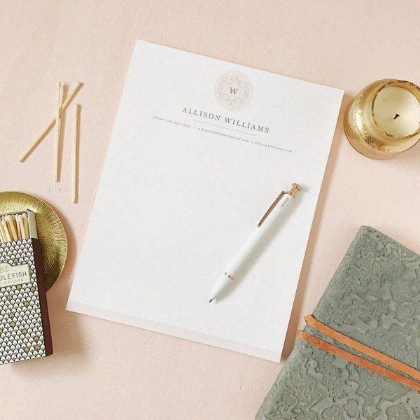
Formal Corporate Letterhead Example
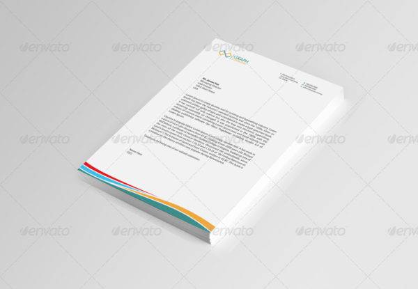
Formal Corporate Letterhead Example Design
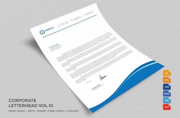
7. Know When to Keep It Formal and Simple
A letterhead in one company may not be suitable for the other. Simple and formal designs will be more suitable for corporate industries and legal or financial firms.
On the other hand, you can adorn your letterhead with metallic, bright colors, and other strange illustrations if you are designing for a company dealing with art and creativity. It is said that it takes a brave designer to create something creative. However, it takes a braver one to do something minimal. There might be an impression that minimal would equate to boring, but it really requires precision and experience to perfect it. You may also like personal letterhead examples.
8. Play with Fun Letterheads
There are companies like an agency or retailer that are creative and hold promotions and events. If you are working with letterheads for this company, you must consider that they might be using their papers for written correspondence with regard to their events and activities which is to be sent to customers and prospects. Hence, the letterhead must be really eye-catching to capture the interest of the readers. A playful letterhead is characterized by repetitive curvy elements with either modern- or retro-inspired color design and a style with a flat design. You may also see business proposal letters.
9. Use Borders with Caution
Definitely, borders can add a good-looking touch to the layout of your letterhead. However, their impact can severely be reduced by the quality of printing. There are times that the printing would result in a wobbly, off-centered, or lopped-off border, resulting to a diminished impact and formality of your design. Avoid these catastrophes by keeping the border thin and minimal, and place your border on the margin and not on the trim edge.
10. Be Consistent with Your Elements
When you are already creating your own logo as well as letterhead design, you might as well extend the design across a complete stationery set. Though you might think that it requires a lot of work, it is much easier than what you actually think. When you already have the logo, color, patterns, and graphics, you can just use these elements for the other stationery design by just switching up the colors or graphics but still maintains a consistent look. You may also see promotion announcement designs.
Having a consistent design throughout your marketing materials will add to your personality and branding. People will easily recognize you through your branding, and they can also identify you from the other companies. For example, if you are using the color blue for your modern logo with an eagle design on its face, you can use the difference shades and hues of blue for your other materials and incorporate vectors and graphics related to an eagle. In such manner, customers can easily identify your company, enhancing your branding and making your name known in the market.
Personalized Formal Letterhead Example
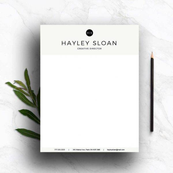
Print Ready Formal Letterhead
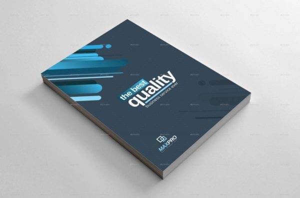
Simple Unique Formal Letterhead Example
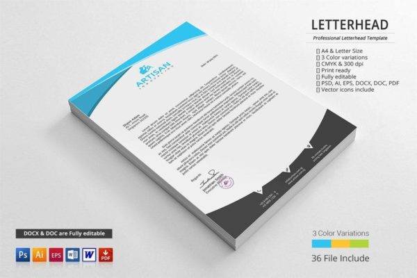
Final Words
It is important to have a consistent letterhead as this is a part of your branding or the identity of your business entity. Letterheads can be sent internally, to the employees, or externally, to outside parties that are still related to the company transactions such as clients or customers, the government, or the suppliers. So, it is important that you make every business paper consistent.
In order to create a ravishing letterhead, there are tips provided above and can be summarized as follows: start simple with your design, be creative even in no-color printing, use the commonly used start-up designs, create a strong brand design, go retro, use a watermark, know when to keep it formal, play with fun letterheads, add borders with caution, and/or be consistent with your elements. These are the primary things that you must be aware of in the start of your letterhead creations. You may also see importance of business cards.
Now that you already know the importance of letterheads especially when it comes to branding and identity of the company, you can now create your own letterhead for your company using the examples presented in the previous section and implementing the tips that you collected above. You may also see reference letters.


