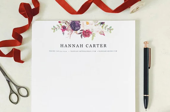
13+ Professional Letterhead Examples to Download
Letters are a necessary medium in business correspondence. They provide a form of transaction that is preferable in certain situations, such as exchanging information. Given online or in person, they must start with something that makes their recipient recognize and give it a priority. One of the things you can use for that is a company letterhead. Using professional letterhead templates ensures that your letterheads are consistent, polished, and create a lasting impression in all your business communications.
13+ Professional Letterhead Designs and Examples
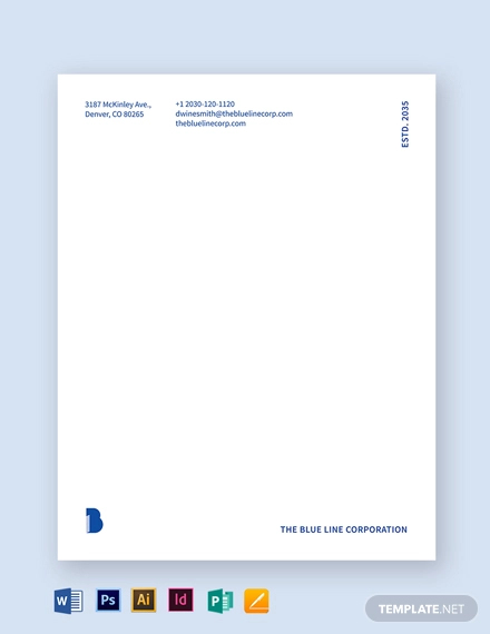
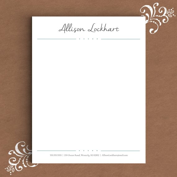
Blue Letterhead Template
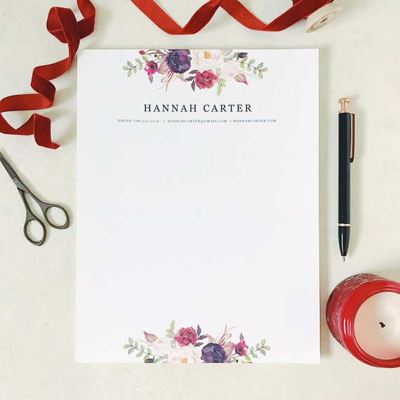
Bohemian Letterhead Design Example
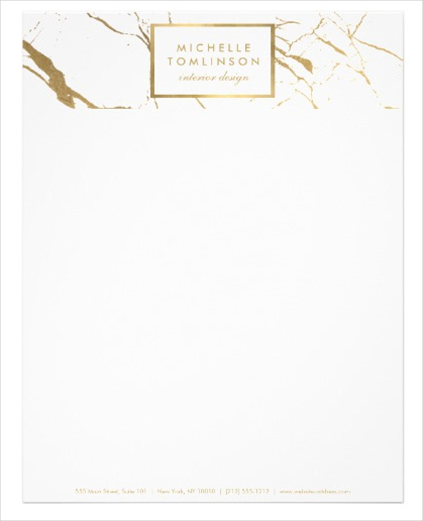
White and Gold Marble Designer Letterhead
Stylish Letterhead Example
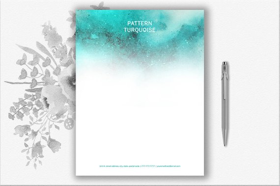
Elegant Turquoise Letterhead Design Example
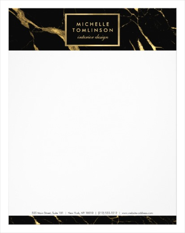
Black and Gold Marble Designer Letterhead
Cute Letterhead Design Example
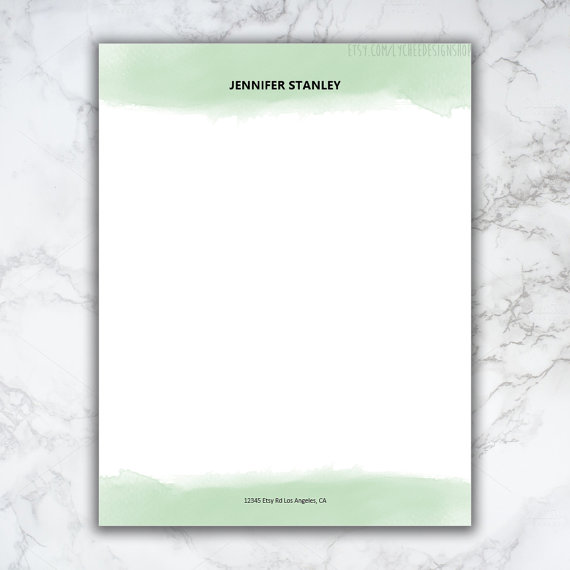
Watercolor Letterhead Design Example
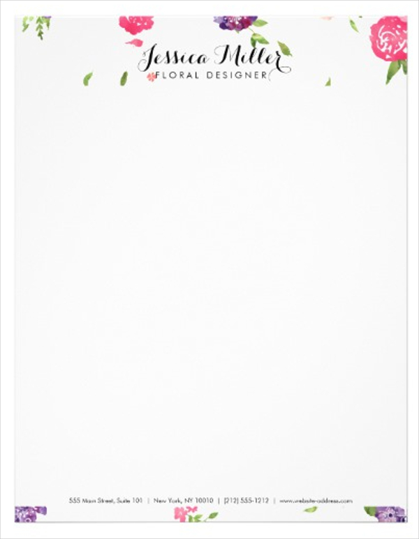
Vintage Watercolor Florals Craft Designer Letterhead
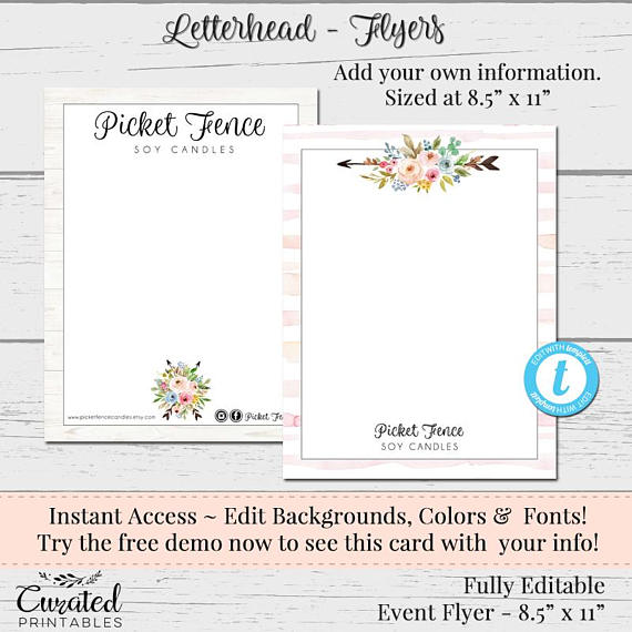
Floral Letterhead Design Example
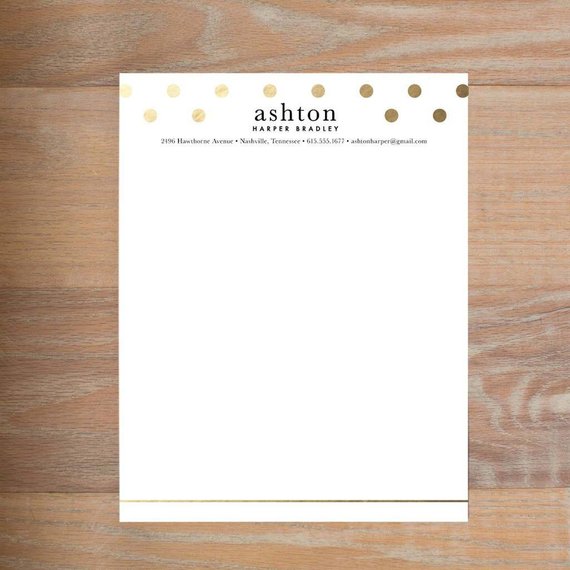
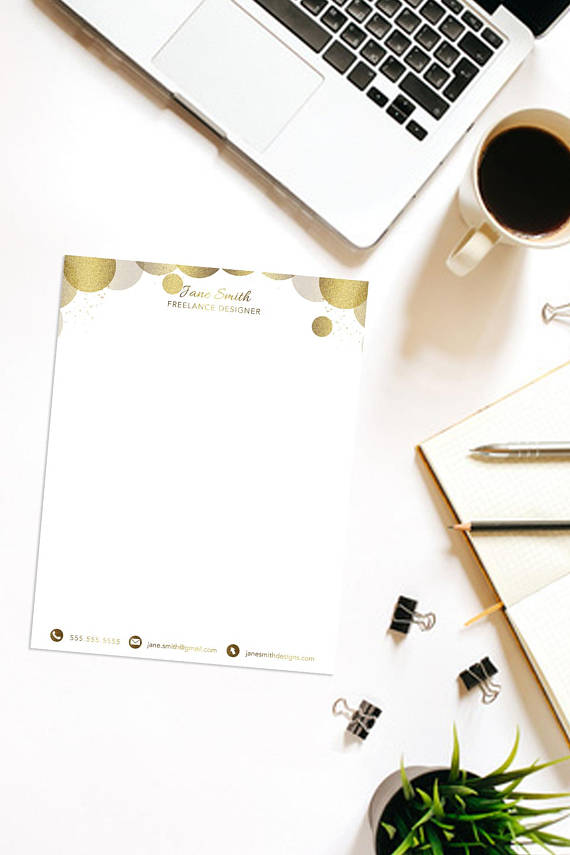
Minimalist Gold Letterhead Design Example
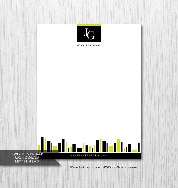
Monogrammed Letterhead Design Example
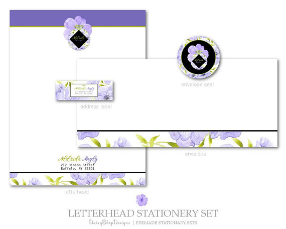
Stationery Set Design Example
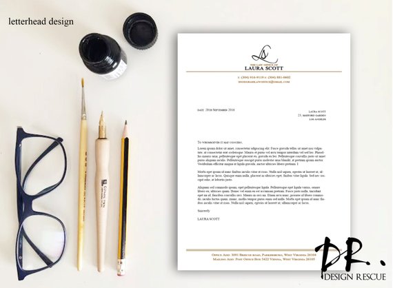
Simple Letterhead Design Example
What is a Letterhead?
Letterheads are an essential aspect of your simple letter. It is a heading placed on the topmost part of your document that contains your company information. These details include the name of the business, address, corporate design or logo, and sometimes even a background or pattern.
How to Make a Letterhead?
According to a graph by Statista, the use of e-signature has been on the rise in the last decade. With transactions done electronically nowadays, it is crucial to make sure all your emails and documents contain other things besides your signature. If you are sending out an important email for a business deal, include the logo of your company and the letterhead to make it legitimate. If you need some help in creating the best letterhead, then check out these tips.
1. Consider your Letterhead’s Size.
When starting with a blank page, it is better to measure how big that space is so you can estimate the elements you need to fill it. Choose a size that will accommodate everything you need in your letterhead without it being too big to take up much of a paper’s space or too small to be too bland.
2. Make Use of the Background.
Since you can’t shower your letterhead with a lot of illustrations and visual designs, making use of the background will seem like the only other way. Aside from the different designs, the environment can enhance and make your letterhead stand out. It will also keep it from looking dull.
3. Incorporate Important Details
This is the meat of your letterhead: to hold your business’s contact information. So include your name, your physical location, your phone number, and email numbers and make sure they are eligible. If your company has a slogan, you may also add it to make your letterhead enhanced with your brand as well.
4. Use Company Colors
Get creative and use colors to give your letterhead an added spice. Certain colors, like yellow, blue, and red, have certain psychological effects on people. They give off confidence and optimism that can already set up the tone for your reader. Use colors that can accentuate all the other elements in your letterhead.
FAQ’s
What makes a letterhead different from a logo?
A logo is a symbol or a design used in an organization to identify its products and spread its brand. A letterhead is a printed heading on a letter that states the personal and contact details of the individual who sent it.
Do I need to add a logo to my letterhead?
It is not necessary to add a logo to your letterhead. But a lot of businesses like to add one to spread their brand.
Who usually uses a letterhead?
A letterhead’s use is being a part of the format for a legal document. Organizations like law firms, schools, a doctor’s practice, and small businesses use letterheads when giving essential documents. This is to make their records legitimate and official. You may even use your letterhead if you are presenting a legal document as well.
A unique letterhead enhances your business’s image, and that is the first thing that customers will perceive. It is the initial factor that will help the clients decide if they will engage with your business or not. Before you even have the chance to speak, your corporate image has already spoken for you. Make sure what it says is only an added perfume to your already sweet smell.


