In a bar chart, which axis typically represents the categories or groups being compared?
Vertical axis
Horizontal axis
Diagonal axis
Depth axis
of 10
Graphs and charts are essential tools for visualizing data, making complex information easier to understand. They transform numerical data into visual representations, allowing for quick insights and comparisons. Common types include bar graphs, line graphs, pie charts, and scatter plots, each suited for different types of data analysis. Tools like a chart maker can be used to enhance the visual appeal of these charts, while chart templates word offers ready-made design elements that simplify presentation. Bar graphs are ideal for comparing discrete categories, while line graphs show trends over time. Pie charts display proportions within a whole, and scatter plots highlight relationships between two variables. By converting data into a visual format, graphs and charts help identify patterns, trends, and outliers, enhancing comprehension and aiding in decision-making. They are widely used in various fields such as business, education, and science to present data clearly and effectively.
Graphs and charts are visual tools used to represent data, making it easier to understand and interpret. They convert numerical information into visual formats like bar graphs, line graphs, pie charts, and scatter plots. Bar graphs compare different categories, line graphs display trends over time, pie charts show parts of a whole, and scatter plots reveal relationships between variables. These visual aids help identify patterns, trends, and outliers, making complex data more accessible. Widely used in various fields, graphs and charts enhance data presentation and support informed decision-making.
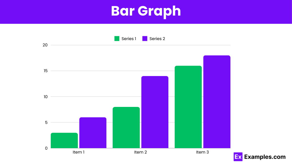
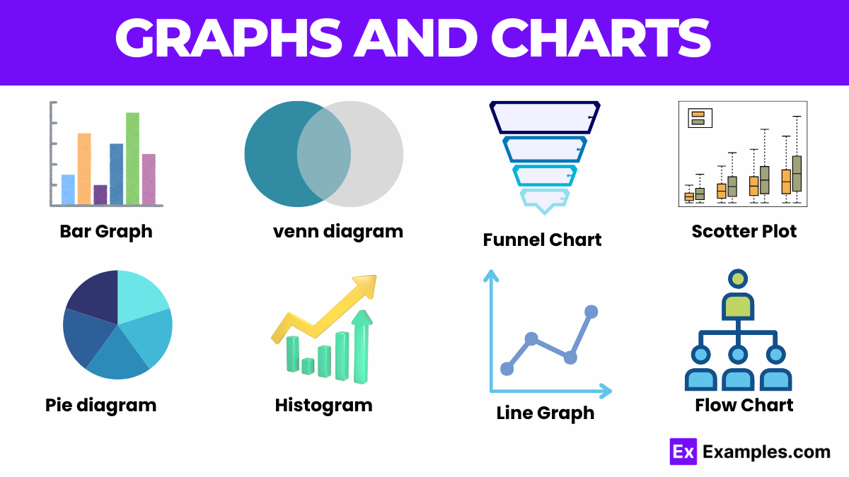
Bar graphs use rectangular bars to compare different categories. The length of each bar represents the value of each category, making it easy to compare data.
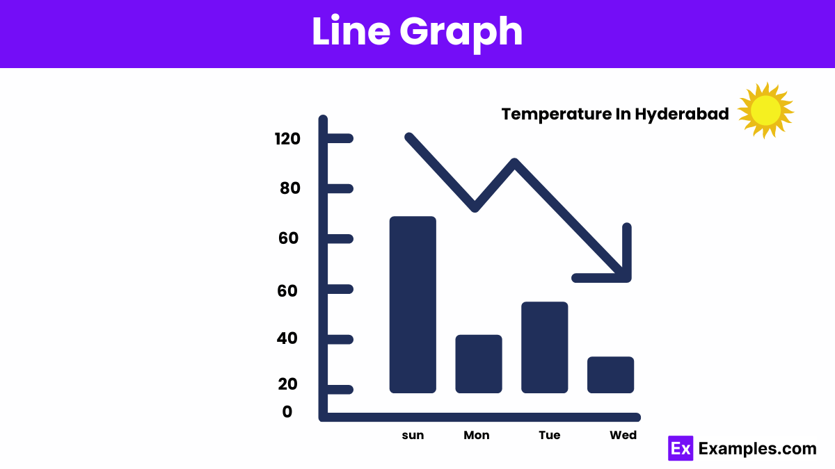
Line graphs display data points connected by lines, showing trends over time. They are ideal for tracking changes and identifying patterns in continuous data.
A pie graph represents data as slices of a circle, each slice showing a proportion of the whole. The size of each slice reflects the percentage of each category.
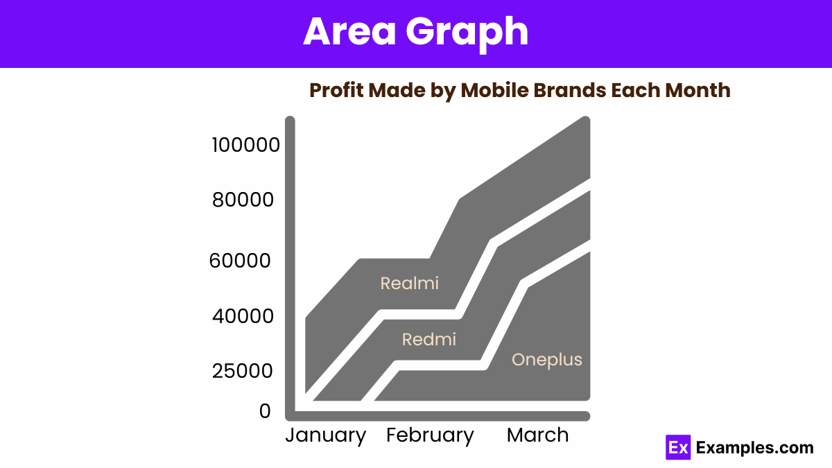
An area graph displays data points connected by lines with the area below filled in, emphasizing the magnitude of change over time.
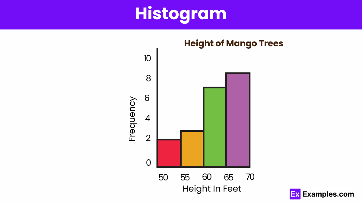
Histograms display the distribution of numerical data by grouping values into bins. The height of each bar shows the frequency of data points within each bin, illustrating data distribution.
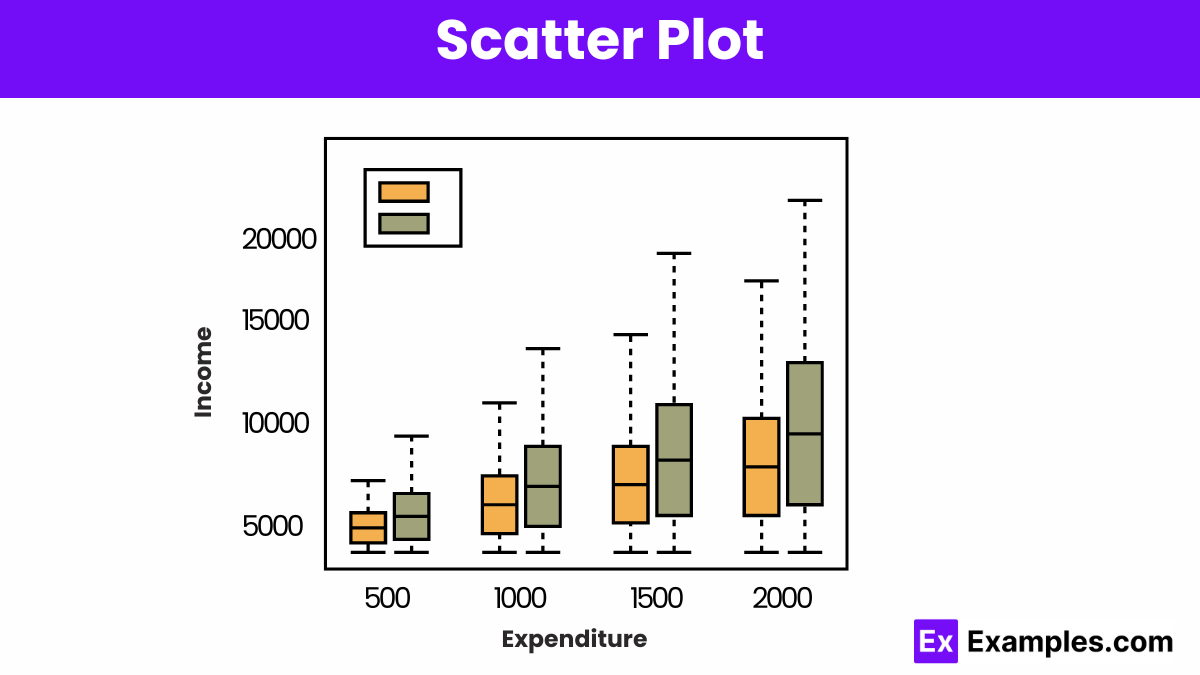
A scatter plot displays the relationship between two variables using dots, revealing patterns, correlations, or clusters within the data.
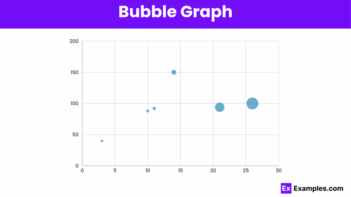
A bubble graph displays three dimensions of data using bubbles. The x and y axes represent two variables, while the bubble size indicates the third variable, showing relationships and comparisons.
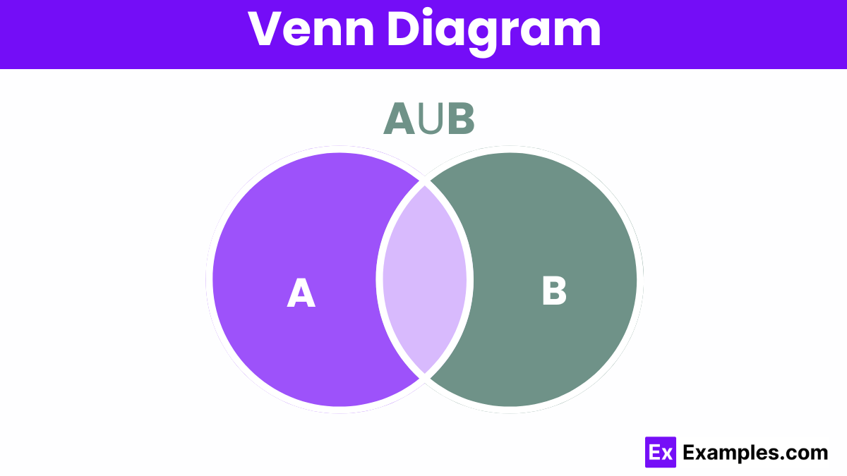
A Venn diagram is a graphical tool that uses overlapping circles to illustrate the logical relationships between two or more sets of items
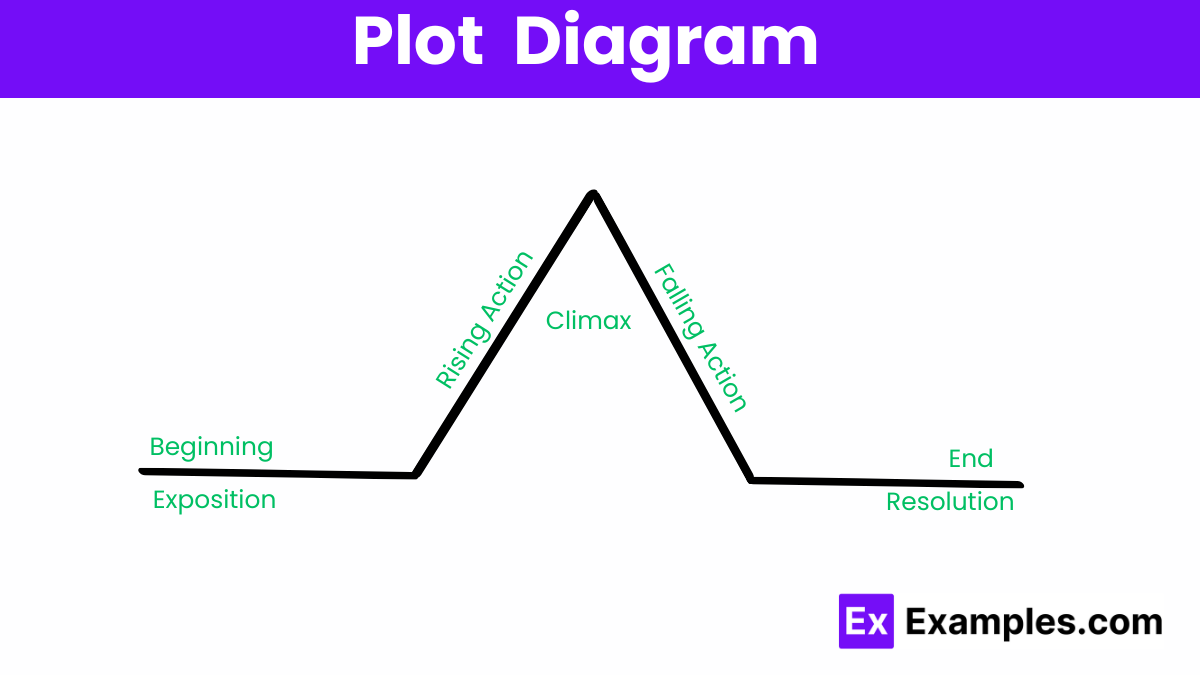
A plot diagram outlines the structure of a story, illustrating key elements like exposition, rising action, climax, falling action, and resolution.
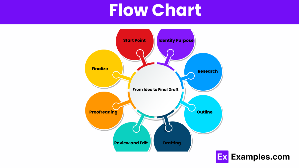
Flowcharts visually represent processes using symbols and arrows, illustrating step-by-step workflows, decisions, and outcomes in an easy-to-understand format.
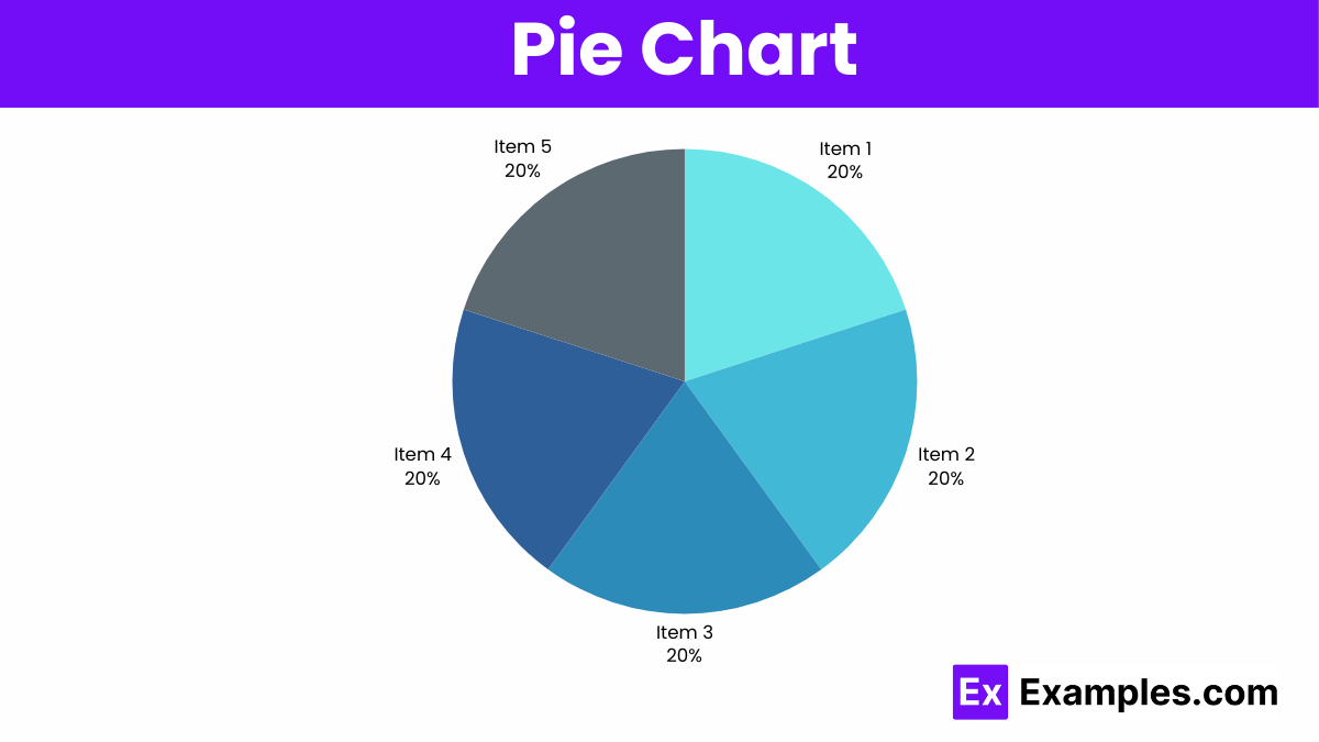
Pie charts display data as slices of a circle, showing proportions within a whole, with each slice representing a percentage.
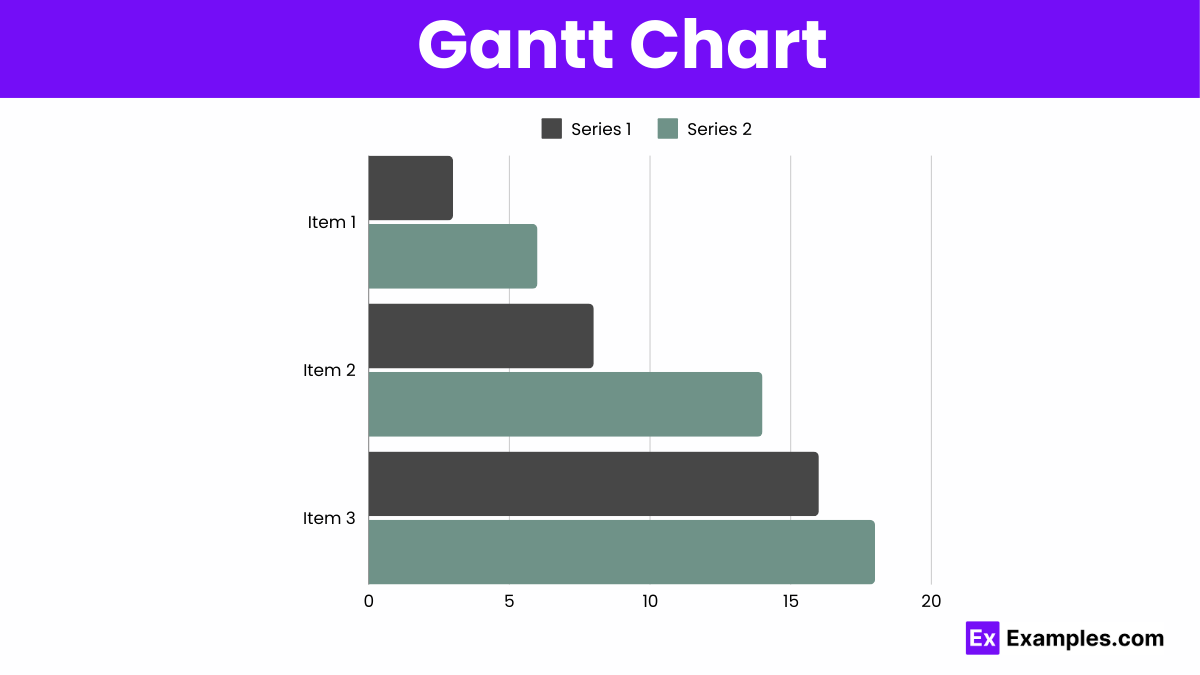
Gantt charts display project schedules, showing tasks along a timeline, illustrating start and end dates, durations, and dependencies.
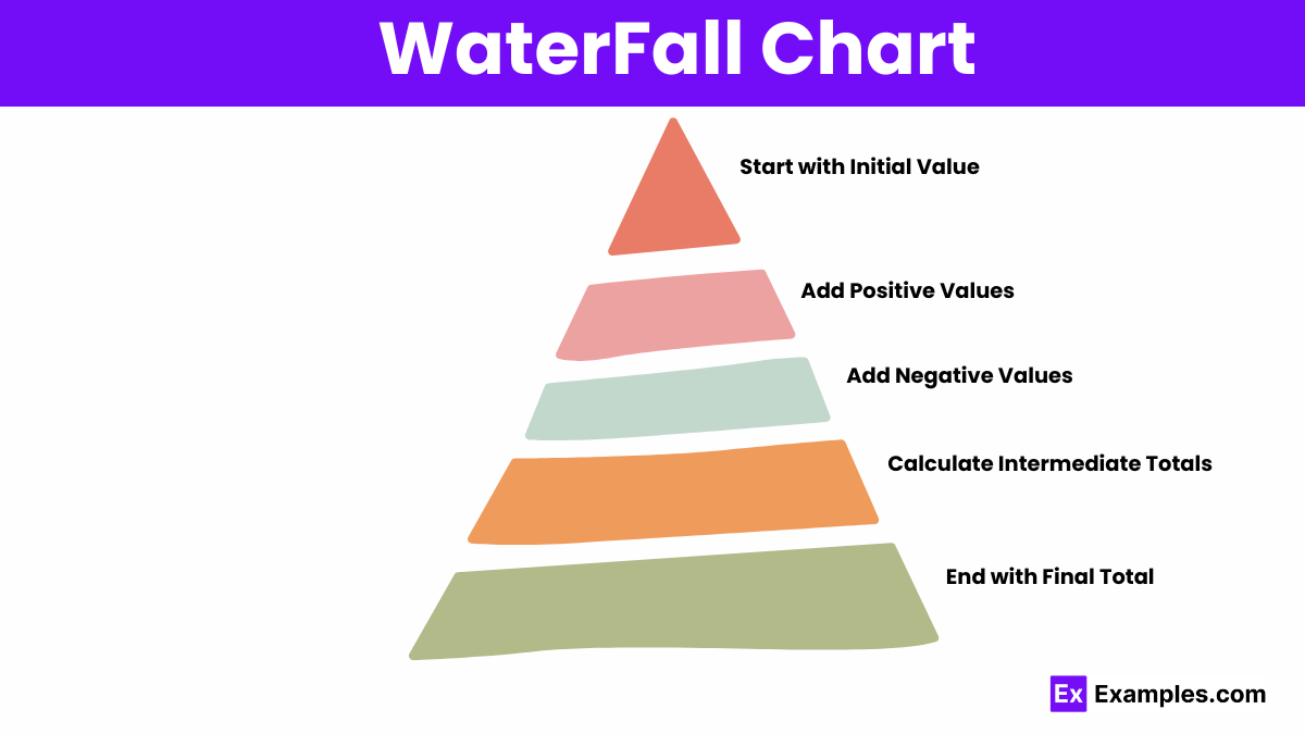
Waterfall charts visually represent cumulative changes in data, illustrating how sequential positive and negative values impact a total.
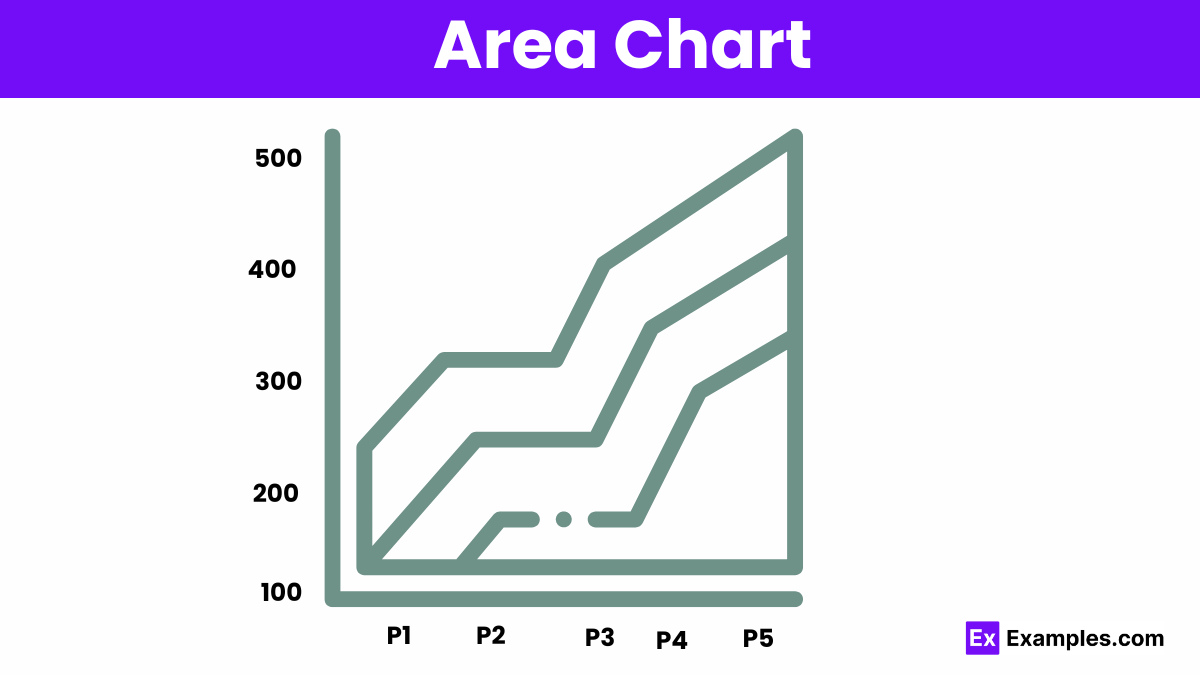
An area chart is a graphical representation of quantitative data, similar to a line graph, but with the area below the line filled in to emphasize volume or cumulative totals over time.
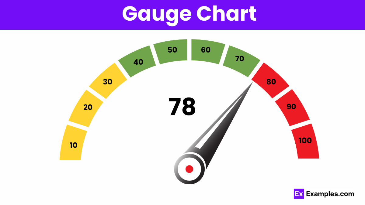
Gauge charts represent data as a dial or speedometer, displaying values within a range to indicate performance or progress.
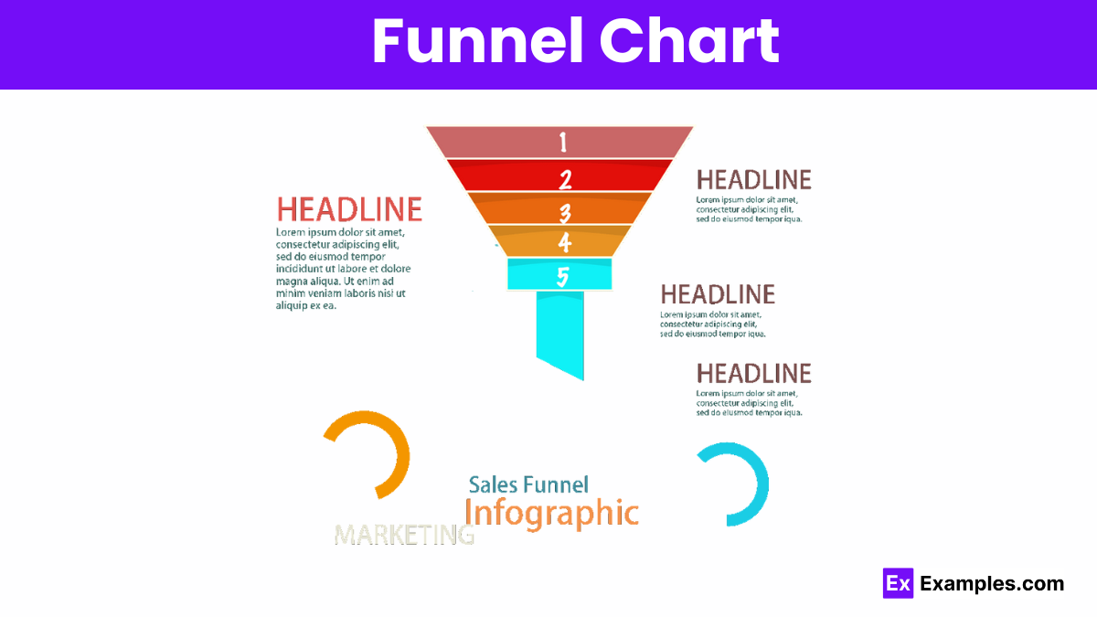
Funnel charts visualize stages in a process, showing data flow and decreasing values, often used for sales and conversion analysis.
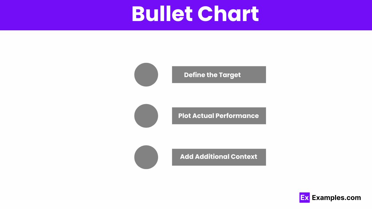
Bullet charts display performance against targets, using bars and markers to compare actual values to benchmarks and qualitative ranges.
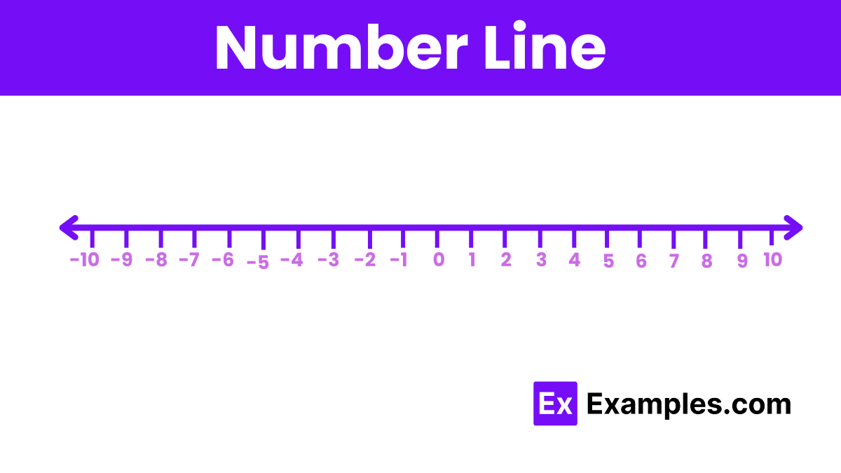
Number lines are visual representations of numbers. They help illustrate mathematical concepts like addition, subtraction, and locating points on a scale.
| Feature | Graphs | Charts |
|---|---|---|
| Purpose | Show relationships between variables | Summarize and compare data in various formats |
| Common Types | Line graphs, scatter plots, bar graphs | Pie charts, bar charts, Gantt charts, bullet charts |
| Axes | Typically use x and y axes | May or may not use axes |
| Data Representation | Visualizes data points and trends | Represents data in structured, often categorical, forms |
| Use Case | Ideal for showing trends and correlations | Ideal for summarizing data and showing distributions |
| Complexity | Often more complex with continuous data | Can be simpler and more intuitive for categorical data |
| Examples | Displaying stock prices over time, correlation between variables | Comparing sales by category, project timelines |
Graphs and charts are powerful tools for data visualization, each suited for different purposes and types of data. Understanding when to use each can enhance data interpretation and decision-making.
1. Showing Trends Over Time:
2. Displaying Relationships Between Variables:
3. Comparing Quantitative Data:
1. Illustrating Proportions and Parts of a Whole:
2. Representing Hierarchical Data:
3. Analyzing Project Timelines and Schedules:
4. Displaying Cumulative Data Changes:
5. Highlighting Performance Against Goals:
Data Visualization is the graphical representation of information and data. By using visual elements like charts, graphs, and maps, data visualization tools provide an accessible way to see and understand trends, outliers, and patterns in data.
An area chart is similar to a line graph, but the area below the line is filled with color to show the volume of the data.
Data visualization helps to simplify complex data, uncover insights, identify trends, and communicate information effectively to diverse audiences.
Popular tools include Microsoft Excel, Google Sheets, Tableau, Power BI, and Google Charts.
Yes, using different chart types can help convey different aspects of your data more effectively. However, ensure that the combination enhances understanding rather than causing confusion.
Effective charts should be clear, accurate, relevant, and aesthetically pleasing. They should include titles, labels, legends, and appropriate scales.
Use contrasting colors, clear labels, and avoid clutter. Ensure that text is legible and that the design highlights the key points you want to communicate.
A trend line is a straight line that best represents the data on a scatter plot or line graph, showing the general direction of the data points.
Use a stacked bar chart to show the breakdown of categories within a total, illustrating how each part contributes to the whole.
Pie charts can be difficult to read when there are too many slices or when the values are very similar. They are best used for simple, clear comparisons of parts of a whole.
Common types include bar charts, line graphs, pie charts, scatter plots, histograms, and area charts.
A pie chart represents data as slices of a circle, where each slice’s size is proportional to its percentage of the whole.

In a bar chart, which axis typically represents the categories or groups being compared?
Vertical axis
Horizontal axis
Diagonal axis
Depth axis
What does a pie chart display?
Quantitative data as segments of a circle
Time-based data on a timeline
Discrete data points in a scatter plot
Frequency distribution in a histogram
What type of chart is best for showing trends over time?
Bar chart
Pie chart
Line graph
Scatter plot
In a scatter plot, what does each point represent?
A category and its frequency
A single data point with two values
A range of data
The total value of a dataset
What does a histogram display?
The relationship between two variables
The total value of different categories
The frequency distribution of continuous data
Time-based changes
How do you interpret the slope of a line in a line graph?
It shows the total number of data points
It indicates the frequency of categories
It represents the rate of change between two variables
It shows the percentage distribution
What is the purpose of a legend in a chart or graph?
To provide the chart’s title
To explain the chart’s data categories or series
To show data values directly
To display a trend line
In a box plot, what does the box represent?
The total range of data
The middle 50% of data values
The mean of the dataset
The highest and lowest data points
What does a cumulative frequency curve (ogive) show?
The total count of data points up to a certain value
The frequency distribution of categories
The average of data values
The relationship between two variables
What is the purpose of using a stacked bar chart?
To compare multiple categories
To show the proportion of each category within a total
To display data trends over time
To illustrate the relationship between two continuous variables