A line graph shows the sales of a company over six months. In which month did the sales peak if the sales were 50 in January, 70 in February, 85 in March, 95 in April, 90 in May, and 80 in June?
January
March
April
June
of 10

A line graph is a unique graph which is commonly used in statistics. This detailed guide is crafted with educators in mind, aiming to bolster their instructional arsenal with lucid and captivating examples. Perfectly suited for demystifying intricate datasets for students, it simplifies the core principles of line graphs in plain English. Designed to motivate fellow educators and equip students with the ability to improve their English communication through mathematical concepts, this resource is set to turn abstract numerical data into engaging narratives.
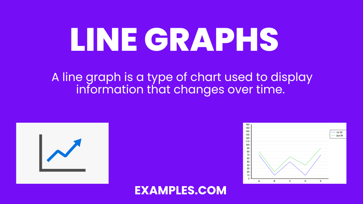
A line graph is a type of chart used to display information that changes over time. It consists of a series of data points connected by straight line segments on a grid. Line graphs are particularly useful for showing trends in data at equal intervals, such as months, years, or other regular time frames. They make it easier to understand how values rise, fall, or stay consistent over a period, providing clear insights into patterns or changes.
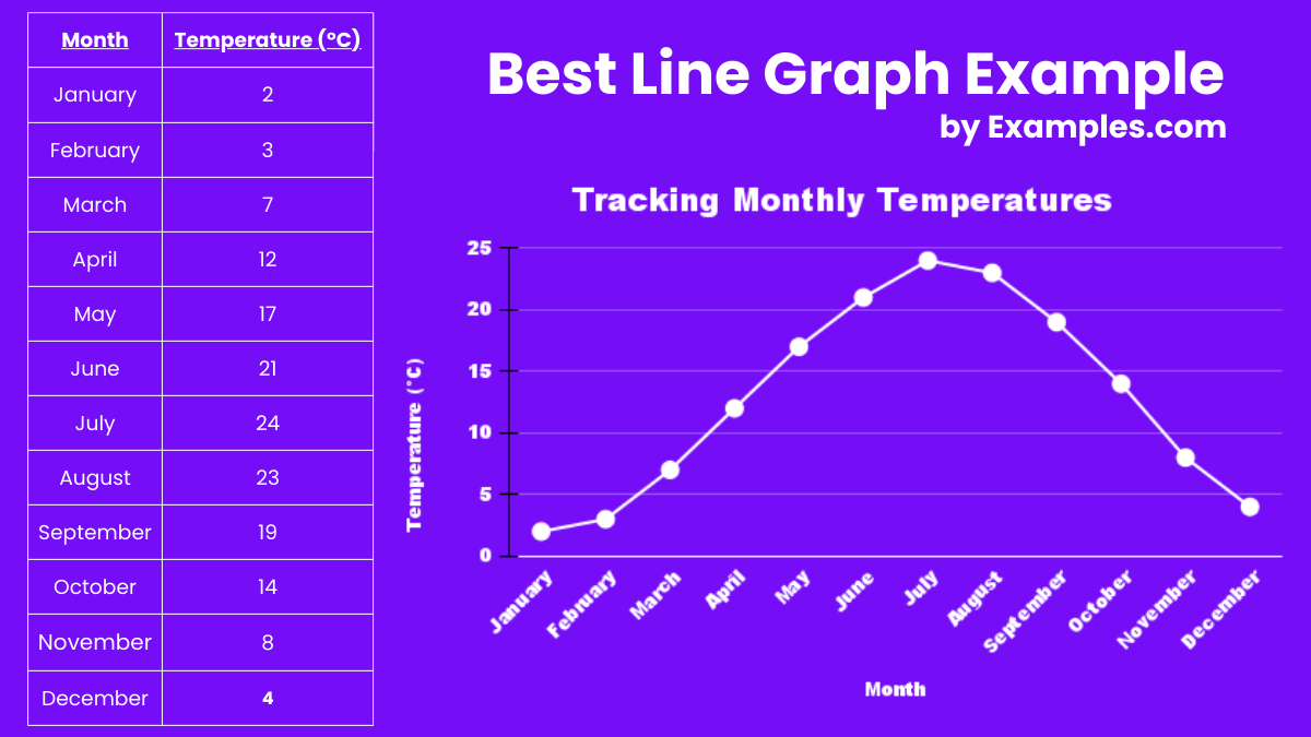
One of the best examples of a line graph is its use in tracking and visualizing temperature changes over the course of a year. This graph plots the average daily temperature for each month on the Y-axis against the months of the year on the X-axis. By connecting the data points for each month with lines, it visually represents the rise and fall of temperatures, highlighting seasonal changes in a clear, intuitive manner. This example effectively demonstrates how line graphs can simplify complex data sets, making it easier for students to understand and analyze temporal trends and patterns.
Line graphs are a powerful tool for visualizing data trends over time, offering clarity and insight into complex information. They’re characterized by their simplicity, effectiveness in showing changes and trends, and ability to compare multiple data sets. Ideal for educators and students alike, understanding the properties of line graphs can significantly enhance data interpretation skills.
1. Continuous Data Representation
Line graphs excel in displaying data that changes continuously over time, making them perfect for tracking the progress of a project or the growth rate of a plant.
2. Trend Identification
Easily identify upward or downward trends in data sets, such as a company’s sales over several months, aiding in forecasting and decision-making.
3. Comparison Ability
Compare multiple data sets side-by-side, for instance, the performance of different students in a class across the academic year.
4. Visual Simplicity
Offer a clean and straightforward visualization, like viewing the daily temperature changes over a week, which makes data easy to understand at a glance.
5. Detailing Fluctuations
Highlight minor fluctuations in data, such as the day-to-day variance in stock market prices, providing deep insights into volatility.
Line graphs come in various formats, each suited to specific types of data analysis and visualization. Recognizing the types of line graphs enhances their application in educational settings, fostering a deeper understanding of data among students
Represents a single data set over time. For example, tracking the amount of rainfall in a region monthly
Make a Copy in Google SheetsCompares several data sets on the same chart, like comparing the monthly sales figures of different products.
Make a Copy in Google SheetsShows the composition of different parts of a whole over time. An instance is illustrating the demographic changes in a population over decades.
Make a Copy in Google SheetsSimilar to the segmented line graph but with the area below the lines filled in, useful for showing the total value of stocks over time.
Make a Copy in Google SheetsDisplays data in a circular format, ideal for comparing cyclic patterns, such as traffic flow during different times of the day.
Make a Copy in Google Sheets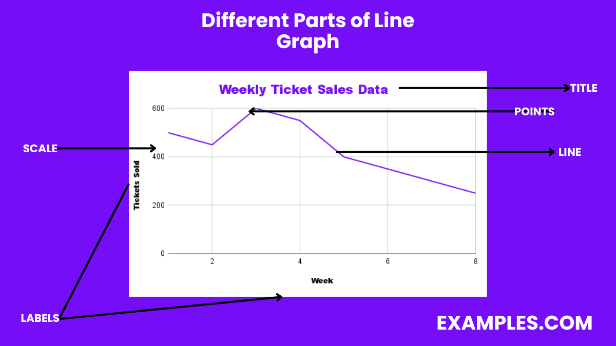
A line graph is composed of several key parts, each serving a specific function in data representation. Familiarity with these components is crucial for teachers and students to effectively create, read, and interpret line graphs.
1. X-axis (Horizontal)
Represents the independent variable, typically time. For instance, the x-axis might denote the months of the year in a graph showing temperature changes.
2. Y-axis (Vertical)
Represents the dependent variable, such as the quantity being measured. In a graph charting company profits, the y-axis would indicate the profit amount.
3. Data Points
Mark the specific values of the data being graphed. In a student’s grade performance graph, each data point represents a grade achieved at a certain time.
4. Lines
Connect the data points, illustrating the trend of the dataset. The slope of these lines can indicate growth or decline, such as in a graph tracking a runner’s speed.
5. Legend
Explains what each line represents, especially in multiple line graphs. It’s essential for distinguishing between different data sets, like in a graph comparing various students’ performances.
Plotting a line graph is a fundamental skill in data visualization, crucial for illustrating trends and changes over time. This process involves selecting a dataset, determining the scale for the X (horizontal) and Y (vertical) axes, and then connecting data points with lines. Line graphs are invaluable for comparing multiple datasets and highlighting relationships within the data. They serve as a visual tool for educators to teach students about data analysis, making abstract concepts tangible and easier to understand.
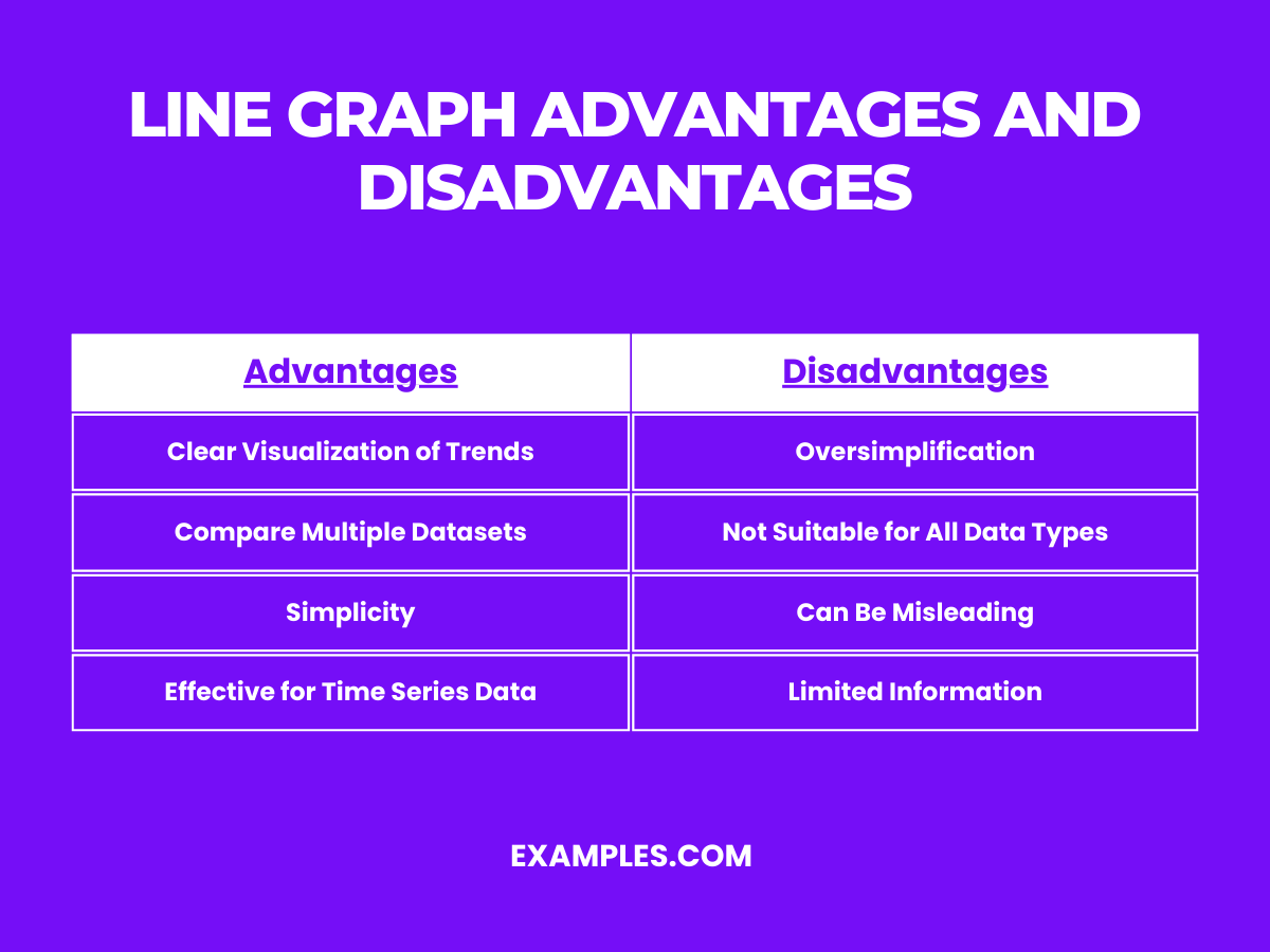
| Advantages | Disadvantages |
|---|---|
| Clear Visualization of Trends: Line graphs make it easy to see upward or downward trends over time. | Oversimplification: May oversimplify complex data sets, leading to misinterpretation. |
| Compare Multiple Datasets: Efficiently compare several data trends on the same graph. | Not Suitable for All Data Types: Best for continuous data, less effective for categorical data. |
| Simplicity: Easy to create and understand, making them accessible for students and professionals. | Can Be Misleading: Scale manipulation can distort the perception of data significance. |
| Effective for Time Series Data: Ideal for displaying data points at regular intervals. | Limited Information: Provides limited detail about the data set as a whole. |
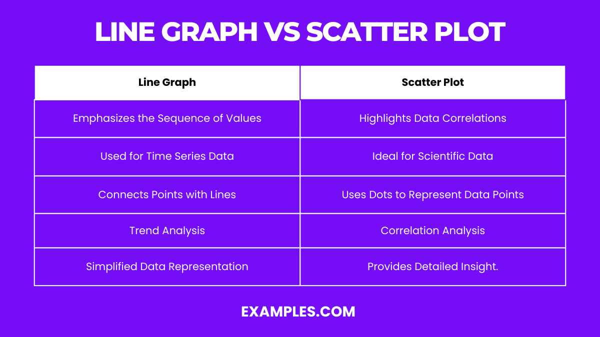
| Line Graph | Scatter Plot |
|---|---|
| Emphasizes the Sequence of Values: Illustrates how data points are connected over time or order. | Highlights Data Correlations: Shows the relationship between two variables without implying causation. |
| Used for Time Series Data: Best suited for data that changes over time. | Ideal for Scientific Data: Effectively displays a wide range of data, from physics experiments to population studies. |
| Connects Points with Lines: This can imply continuity between points. | Uses Dots to Represent Data Points: Each dot represents an individual data value, making it easy to identify outliers. |
| Trend Analysis: Primarily used to identify trends in data over periods. | Correlation Analysis: Used to deduce the strength and direction of a relationship between two variables. |
| Simplified Data Representation: Can make complex data more comprehensible. | Provides Detailed Insights: Offers a more nuanced view of data distributions and relationships. |
These tables and examples aim to enrich the teaching toolkit, facilitating the conveyance of complex data analysis concepts in a straightforward, engaging manner to students.
Creating a line graph involves plotting data points on a two-dimensional plane and connecting them with lines to visualize changes over time. This process helps in identifying trends, patterns, and potential anomalies within the dataset. Ideal for students and teachers, mastering this skill enhances data interpretation and communication in a straightforward manner, making complex information easily understandable.
1. Monthly Temperature Tracking
Plot average temperatures for each month on the Y-axis against months on the X-axis. This graph displays seasonal temperature shifts, making it easier to understand climate patterns.
2. Stock Market Trends
Represent daily closing prices of a stock over a year. This line graph helps investors identify growth trends and market volatility.
3. Student Grades Over Time
Chart a student’s exam scores throughout the academic year. It visually demonstrates improvement or need for additional support.
4. Website Traffic Analysis
Plot daily visitors to a website over several months. This graph showcases traffic trends and the impact of marketing campaigns.
5. Water Consumption Daily
Document daily water usage in a household. Analyzing this line graph can lead to insights on peak usage times and conservation opportunities.
A double line graph is a powerful tool for comparing two related sets of data over the same time period. By plotting two lines on the same graph, users can easily compare and contrast trends, patterns, and relationships between the datasets. This method is particularly useful in educational settings, aiding teachers and students in a dual data analysis.
1. Comparing Two Product Sales
Illustrate monthly sales of two different products. This graph helps businesses analyze product performance and market preferences.
2. Daily Temperatures of Two Cities
Compare daily temperatures of two cities over a month. It provides insights into climate differences and seasonal changes.
3. Attendance in Two Classes
Show the daily attendance records of two different classes. This comparison can reveal patterns in student attendance.
4. Energy Consumption of Appliances
Compare the electricity consumption of two appliances over time. This graph aids in identifying which appliance is more energy-efficient.
5. Growth Rate of Two Plants
Track the growth of two plant species under the same conditions. This graph visually compares growth rates and health.
Line graphs serve multiple purposes across various fields, making them an indispensable tool in data visualization. They excel at tracking changes over time, highlighting trends, and comparing different datasets. Teachers leverage line graphs to simplify complex data for students, fostering a better understanding of mathematical concepts and improving analytical skills.
1. Economic Growth Measurement
Economists use line graphs to track GDP growth over years, visualizing economic health and trends.
2. Population Growth Over Time
Demographers chart population changes, aiding in resource planning and demographic studies.
3. Annual Rainfall Comparison
Environmental scientists compare yearly rainfall to study climate change effects on local ecosystems.
4. Heart Rate Monitoring
Health professionals monitor patient heart rates during different activities, identifying potential health issues.
5. Traffic Flow Analysis
Urban planners analyze traffic patterns at different times, assisting in urban development and planning.
In conclusion, line graphs serve as powerful tools for visualizing data trends over time, offering clear insights into the dynamics of variables such as weekly ticket sales. By plotting weeks against tickets sold, we can discern patterns, peaks, and troughs, enabling both educators and students to understand and communicate complex data in a straightforward, engaging manner.

A line graph is a unique graph which is commonly used in statistics. This detailed guide is crafted with educators in mind, aiming to bolster their instructional arsenal with lucid and captivating examples. Perfectly suited for demystifying intricate datasets for students, it simplifies the core principles of line graphs in plain English. Designed to motivate fellow educators and equip students with the ability to improve their English communication through mathematical concepts, this resource is set to turn abstract numerical data into engaging narratives.
A line graph is a type of chart used to display information that changes over time. It consists of a series of data points connected by straight line segments on a grid. Line graphs are particularly useful for showing trends in data at equal intervals, such as months, years, or other regular time frames. They make it easier to understand how values rise, fall, or stay consistent over a period, providing clear insights into patterns or changes.
One of the best examples of a line graph is its use in tracking and visualizing temperature changes over the course of a year. This graph plots the average daily temperature for each month on the Y-axis against the months of the year on the X-axis. By connecting the data points for each month with lines, it visually represents the rise and fall of temperatures, highlighting seasonal changes in a clear, intuitive manner. This example effectively demonstrates how line graphs can simplify complex data sets, making it easier for students to understand and analyze temporal trends and patterns.
Line graphs are a powerful tool for visualizing data trends over time, offering clarity and insight into complex information. They’re characterized by their simplicity, effectiveness in showing changes and trends, and ability to compare multiple data sets. Ideal for educators and students alike, understanding the properties of line graphs can significantly enhance data interpretation skills.
1. Continuous Data Representation
Line graphs excel in displaying data that changes continuously over time, making them perfect for tracking the progress of a project or the growth rate of a plant.
2. Trend Identification
Easily identify upward or downward trends in data sets, such as a company’s sales over several months, aiding in forecasting and decision-making.
3. Comparison Ability
Compare multiple data sets side-by-side, for instance, the performance of different students in a class across the academic year.
4. Visual Simplicity
Offer a clean and straightforward visualization, like viewing the daily temperature changes over a week, which makes data easy to understand at a glance.
5. Detailing Fluctuations
Highlight minor fluctuations in data, such as the day-to-day variance in stock market prices, providing deep insights into volatility.
Line graphs come in various formats, each suited to specific types of data analysis and visualization. Recognizing the types of line graphs enhances their application in educational settings, fostering a deeper understanding of data among students
Represents a single data set over time. For example, tracking the amount of rainfall in a region monthly
Compares several data sets on the same chart, like comparing the monthly sales figures of different products.
Shows the composition of different parts of a whole over time. An instance is illustrating the demographic changes in a population over decades.
Similar to the segmented line graph but with the area below the lines filled in, useful for showing the total value of stocks over time.
Displays data in a circular format, ideal for comparing cyclic patterns, such as traffic flow during different times of the day.
A line graph is composed of several key parts, each serving a specific function in data representation. Familiarity with these components is crucial for teachers and students to effectively create, read, and interpret line graphs.
1. X-axis (Horizontal)
Represents the independent variable, typically time. For instance, the x-axis might denote the months of the year in a graph showing temperature changes.
2. Y-axis (Vertical)
Represents the dependent variable, such as the quantity being measured. In a graph charting company profits, the y-axis would indicate the profit amount.
3. Data Points
Mark the specific values of the data being graphed. In a student’s grade performance graph, each data point represents a grade achieved at a certain time.
4. Lines
Connect the data points, illustrating the trend of the dataset. The slope of these lines can indicate growth or decline, such as in a graph tracking a runner’s speed.
5. Legend
Explains what each line represents, especially in multiple line graphs. It’s essential for distinguishing between different data sets, like in a graph comparing various students’ performances.
Plotting a line graph is a fundamental skill in data visualization, crucial for illustrating trends and changes over time. This process involves selecting a dataset, determining the scale for the X (horizontal) and Y (vertical) axes, and then connecting data points with lines. Line graphs are invaluable for comparing multiple datasets and highlighting relationships within the data. They serve as a visual tool for educators to teach students about data analysis, making abstract concepts tangible and easier to understand.
Monthly Sales Revenue: Illustrates the rise and fall in sales revenue over a year, helping businesses strategize.
Daily Temperature Readings: Shows temperature fluctuations throughout a month, useful for studying climate patterns.
Stock Market Trends: Tracks the performance of stocks over time, aiding investors in decision-making.
Website Traffic: Displays daily or monthly visitor counts, highlighting peak times and growth trends.
Classroom Test Scores: Compares the average scores of different tests, showing academic progress or areas needing improvement.
Advantages | Disadvantages |
|---|---|
Clear Visualization of Trends: Line graphs make it easy to see upward or downward trends over time. | Oversimplification: May oversimplify complex data sets, leading to misinterpretation. |
Compare Multiple Datasets: Efficiently compare several data trends on the same graph. | Not Suitable for All Data Types: Best for continuous data, less effective for categorical data. |
Simplicity: Easy to create and understand, making them accessible for students and professionals. | Can Be Misleading: Scale manipulation can distort the perception of data significance. |
Effective for Time Series Data: Ideal for displaying data points at regular intervals. | Limited Information: Provides limited detail about the data set as a whole. |
Line Graph | Scatter Plot |
|---|---|
Emphasizes the Sequence of Values: Illustrates how data points are connected over time or order. | Highlights Data Correlations: Shows the relationship between two variables without implying causation. |
Used for Time Series Data: Best suited for data that changes over time. | Ideal for Scientific Data: Effectively displays a wide range of data, from physics experiments to population studies. |
Connects Points with Lines: This can imply continuity between points. | Uses Dots to Represent Data Points: Each dot represents an individual data value, making it easy to identify outliers. |
Trend Analysis: Primarily used to identify trends in data over periods. | Correlation Analysis: Used to deduce the strength and direction of a relationship between two variables. |
Simplified Data Representation: Can make complex data more comprehensible. | Provides Detailed Insights: Offers a more nuanced view of data distributions and relationships. |
These tables and examples aim to enrich the teaching toolkit, facilitating the conveyance of complex data analysis concepts in a straightforward, engaging manner to students.
Creating a line graph involves plotting data points on a two-dimensional plane and connecting them with lines to visualize changes over time. This process helps in identifying trends, patterns, and potential anomalies within the dataset. Ideal for students and teachers, mastering this skill enhances data interpretation and communication in a straightforward manner, making complex information easily understandable.
1. Monthly Temperature Tracking
Plot average temperatures for each month on the Y-axis against months on the X-axis. This graph displays seasonal temperature shifts, making it easier to understand climate patterns.
2. Stock Market Trends
Represent daily closing prices of a stock over a year. This line graph helps investors identify growth trends and market volatility.
3. Student Grades Over Time
Chart a student’s exam scores throughout the academic year. It visually demonstrates improvement or need for additional support.
4. Website Traffic Analysis
Plot daily visitors to a website over several months. This graph showcases traffic trends and the impact of marketing campaigns.
5. Water Consumption Daily
Document daily water usage in a household. Analyzing this line graph can lead to insights on peak usage times and conservation opportunities.
A double line graph is a powerful tool for comparing two related sets of data over the same time period. By plotting two lines on the same graph, users can easily compare and contrast trends, patterns, and relationships between the datasets. This method is particularly useful in educational settings, aiding teachers and students in a dual data analysis.
1. Comparing Two Product Sales
Illustrate monthly sales of two different products. This graph helps businesses analyze product performance and market preferences.
2. Daily Temperatures of Two Cities
Compare daily temperatures of two cities over a month. It provides insights into climate differences and seasonal changes.
3. Attendance in Two Classes
Show the daily attendance records of two different classes. This comparison can reveal patterns in student attendance.
4. Energy Consumption of Appliances
Compare the electricity consumption of two appliances over time. This graph aids in identifying which appliance is more energy-efficient.
5. Growth Rate of Two Plants
Track the growth of two plant species under the same conditions. This graph visually compares growth rates and health.
Line graphs serve multiple purposes across various fields, making them an indispensable tool in data visualization. They excel at tracking changes over time, highlighting trends, and comparing different datasets. Teachers leverage line graphs to simplify complex data for students, fostering a better understanding of mathematical concepts and improving analytical skills.
1. Economic Growth Measurement
Economists use line graphs to track GDP growth over years, visualizing economic health and trends.
2. Population Growth Over Time
Demographers chart population changes, aiding in resource planning and demographic studies.
3. Annual Rainfall Comparison
Environmental scientists compare yearly rainfall to study climate change effects on local ecosystems.
4. Heart Rate Monitoring
Health professionals monitor patient heart rates during different activities, identifying potential health issues.
5. Traffic Flow Analysis
Urban planners analyze traffic patterns at different times, assisting in urban development and planning.
In conclusion, line graphs serve as powerful tools for visualizing data trends over time, offering clear insights into the dynamics of variables such as weekly ticket sales. By plotting weeks against tickets sold, we can discern patterns, peaks, and troughs, enabling both educators and students to understand and communicate complex data in a straightforward, engaging manner.
A line graph shows the sales of a company over six months. In which month did the sales peak if the sales were 50 in January, 70 in February, 85 in March, 95 in April, 90 in May, and 80 in June?
January
March
April
June
A line graph displays the temperature over a week. On which day was the temperature the lowest if the temperatures were 32°F on Monday, 35°F on Tuesday, 30°F on Wednesday, 28°F on Thursday, 31°F on Friday, 34°F on Saturday, and 33°F on Sunday?
Monday
Wednesday
Thursday
Friday
In a line graph showing the stock prices of a company over five days, which day shows the greatest increase from the previous day if the prices were $100 on Monday, $105 on Tuesday, $110 on Wednesday, $115 on Thursday, and $120 on Friday?
Monday
Tuesday
Wednesday
Thursday
A line graph shows the population growth in a city over four years. In which year was the population the highest if the population was 1,000,000 in 2020, 1,100,000 in 2021, 1,200,000 in 2022, and 1,250,000 in 2023?
2020
2021
2022
2023
A line graph depicts the number of books read by a student each month for four months. In which month did the student read the fewest books if the numbers were 8 in January, 12 in February, 10 in March, and 9 in April?
January
Februay
March
April
A line graph shows the rainfall (in inches) over six months. In which month did the rainfall decrease the most from the previous month if the rainfall was 4 inches in January, 5 inches in February, 3 inches in March, 2 inches in April, 3 inches in May, and 4 inches in June?
January
February
March
April
In a line graph showing the number of visitors to a park over five days, on which day did the number of visitors remain constant compared to the previous day if the visitors were 200 on Monday, 220 on Tuesday, 220 on Wednesday, 230 on Thursday, and 240 on Friday?
Monday
Tuesday
Wednesday
Thursday
A line graph illustrates the growth of a plant over five weeks. In which week did the plant grow the most if the heights were 10 cm in week 1, 15 cm in week 2, 25 cm in week 3, 30 cm in week 4, and 35 cm in week 5?
Week 1
Week 2
Week 3
Week 4
A line graph represents the profits of a company over six months. In which month did the profits decrease compared to the previous month if the profits were $10,000 in January, $12,000 in February, $14,000 in March, $13,000 in April, $15,000 in May, and $17,000 in June?
February
March
April
May
A line graph shows the number of miles run by an athlete each week for four weeks. In which week did the athlete run the most miles if the distances were 10 miles in week 1, 15 miles in week 2, 12 miles in week 3, and 18 miles in week 4?
Week 1
Week 2
Week 3
Week 4